---
execute:
eval: true
---
# Bayesian Inference: A Different Way to Think About Evidence {#sec-bayesian-inference}
```{r}
#| include: false
library(tidyverse)
library(knitr)
```
::: {.callout-tip}
## Prerequisites
This chapter assumes you are comfortable with: (1) probability and Bayes' theorem (@sec-probability), (2) basic R or Python programming (@sec-setup), and (3) the regression concepts from @sec-regression. If Bayes' theorem feels unfamiliar, review @sec-bayes-theorem before continuing.
:::
## Introduction
You have now completed the core statistical methods that form the backbone of most clinical research: regression, splines, penalised regression, and survival analysis. All of these methods share a common philosophical framework --- they are **frequentist**. In this part of the course, we step back to explore a fundamentally different way of thinking about evidence.
Every statistical method you have learned so far in this course has been **frequentist**. In frequentist statistics, probability refers to long-run frequencies: "if we repeated this experiment infinitely many times, the parameter would fall in our 95% confidence interval 95% of the time." That is a mathematically precise statement, but it is not the question most clinicians actually want answered. What clinicians want to know is: *given the data I have in front of me, what is the probability that this treatment works?*
Bayesian inference answers that question directly. It treats probability as a measure of **uncertainty** --- a degree of belief --- rather than a long-run frequency. This chapter introduces the Bayesian framework from first principles, shows you how it works with a medical example you already understand (diagnostic testing), and then builds toward the computational machinery (MCMC) that makes modern Bayesian analysis possible.
::: {.callout-note}
## Why now?
Bayesian methods are increasingly required in clinical research. The US FDA released updated guidance in 2026 on the use of Bayesian statistics in medical device trials, and Bayesian adaptive trial designs are now standard in oncology. Understanding this framework is no longer optional for quantitative researchers in medicine and public health.
:::
::: {.callout-note title="Notation used in this chapter"}
- $P(A \mid B)$ means "the probability of A, given that B is true"
- $\theta$ (theta) is the parameter we want to estimate (e.g., a treatment effect)
- $D$ stands for "data" — the observations we have collected
- $\propto$ means "is proportional to"
:::
## Two Philosophies of Probability
### The Frequentist View
In the frequentist framework:
- **Parameters are fixed** but unknown constants.
- **Data are random** --- they vary from sample to sample.
- **Probability** describes the long-run frequency of events across hypothetical replications.
- A 95% confidence interval means: if we repeated this study infinitely, 95% of the resulting intervals would contain the true parameter.
The frequentist approach does **not** assign a probability to the parameter itself. You cannot say "there is a 95% probability that the true effect lies in this interval" --- even though nearly everyone, including many researchers, interprets confidence intervals that way.
### The Bayesian View
In the Bayesian framework:
- **Parameters are uncertain** and described by probability distributions.
- **Data are fixed** --- once observed, they do not change.
- **Probability** quantifies our degree of belief or uncertainty about unknown quantities.
- A 95% credible interval means exactly what it sounds like: there is a 95% probability that the parameter lies in this interval, given the data and the model.
| Feature | Frequentist | Bayesian |
|---|---|---|
| What is probability? | Long-run frequency | Degree of belief |
| Parameters | Fixed, unknown | Random variables with distributions |
| Data | Random (varies across replications) | Fixed (observed once) |
| Inference | P-values, confidence intervals | Posterior distributions, credible intervals |
| Prior information | Not formally incorporated | Formally incorporated via priors |
: Comparison of frequentist and Bayesian frameworks {#tbl-freq-vs-bayes}
## Bayes' Theorem: You Already Know This
Bayes' theorem is the mathematical engine of Bayesian inference. You have seen it before in epidemiology, even if it was not called by that name.
$$
P(\theta \mid D) = \frac{P(D \mid \theta) \, P(\theta)}{P(D)}
$$
Where:
- $P(\theta \mid D)$ is the **posterior** --- our updated belief about the parameter $\theta$ after seeing data $D$.
- $P(D \mid \theta)$ is the **likelihood** --- how probable the observed data are under a particular value of $\theta$.
- $P(\theta)$ is the **prior** --- our belief about $\theta$ before seeing the data.
- $P(D)$ is the **marginal likelihood** (or evidence) --- a normalising constant that ensures the posterior integrates to 1.
In words: **Posterior $\propto$ Likelihood $\times$ Prior**.
### A Medical Example: COVID-19 Rapid Testing
Suppose a new rapid antigen test for COVID-19 has:
- **Sensitivity** = 85% (probability of a positive test given truly infected)
- **Specificity** = 98% (probability of a negative test given truly uninfected)
A patient in your emergency department tests positive. What is the probability they actually have COVID-19?
This depends on the **prevalence** (the prior probability of disease). Let us work through two scenarios.
**Scenario 1: High prevalence (20% --- during a winter surge)**
$$
P(\text{COVID} \mid +) = \frac{P(+ \mid \text{COVID}) \times P(\text{COVID})}{P(+)}
$$
$$
= \frac{0.85 \times 0.20}{(0.85 \times 0.20) + (0.02 \times 0.80)} = \frac{0.17}{0.17 + 0.016} = \frac{0.17}{0.186} \approx 0.914
$$
A positive test in a high-prevalence setting gives a 91.4% posterior probability of disease.
**Scenario 2: Low prevalence (1% --- summer, low community transmission)**
$$
P(\text{COVID} \mid +) = \frac{0.85 \times 0.01}{(0.85 \times 0.01) + (0.02 \times 0.99)} = \frac{0.0085}{0.0085 + 0.0198} = \frac{0.0085}{0.0283} \approx 0.300
$$
The same positive test now gives only a 30% posterior probability. The **prior matters**.
This is Bayesian reasoning in its simplest form: your conclusion depends on what you knew before you saw the evidence. Every Bayesian analysis extends this logic to continuous parameters and complex models.
## Prior Distributions
The prior distribution encodes what we know (or do not know) about a parameter before collecting data. Choosing an appropriate prior is one of the most important --- and most debated --- steps in Bayesian analysis.
### Types of Priors
**Uninformative (flat) priors** assign equal probability to all values. For example, a uniform distribution over $(-\infty, +\infty)$ for a regression coefficient. These are sometimes called "objective" priors because they appear to let the data speak for themselves.
- In practice, truly flat priors are improper (they do not integrate to 1) and can cause computational problems.
- They are rarely truly uninformative --- a flat prior on a log-odds scale is not flat on the probability scale.
**Weakly informative priors** gently constrain parameters to reasonable ranges without being strongly opinionated. For example, a $\text{Normal}(0, 10)$ prior on a log-odds regression coefficient says: "I think the coefficient is probably somewhere between --20 and +20 on the log-odds scale, but I am not very sure."
- These are the **recommended default** for most applied work.
- They prevent the model from exploring absurd parameter values while remaining flexible.
- Andrew Gelman's recommendation: use priors that rule out implausible values but remain vague within the plausible range.
**Informative priors** incorporate genuine prior knowledge. For example, if previous meta-analyses show that a drug reduces mortality by 10--30%, you might use a prior centred on that range.
- These are especially valuable in small-sample settings (paediatric trials, rare diseases).
- They must be justified and subjected to sensitivity analysis.
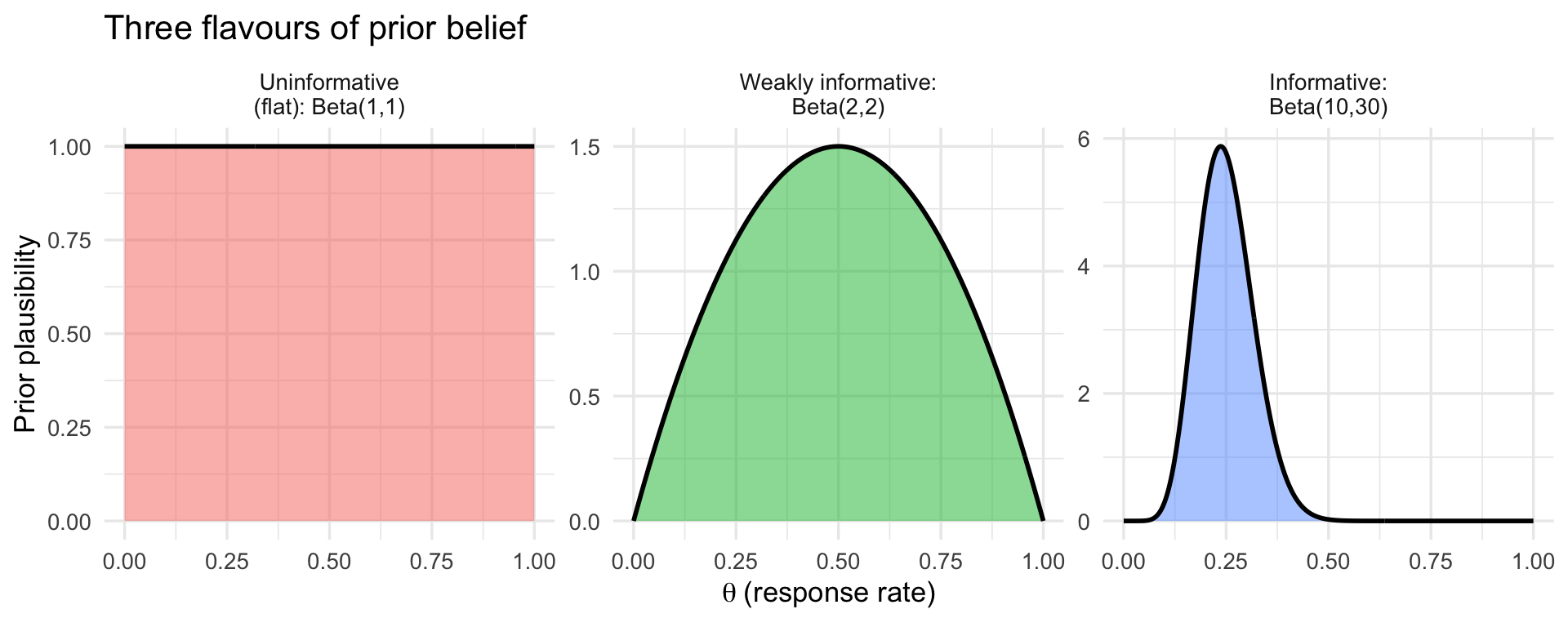
The three types are easiest to grasp visually. The figure below shows the same idea --- a prior belief about a response rate $\theta$ between 0 and 1 --- expressed three ways: a *flat* prior that treats every rate as equally plausible, a *weakly informative* prior that gently favours the middle while staying open-minded, and an *informative* prior that encodes a specific prior belief (here, a rate around 25%). Think of it as a dial for *how strong an opinion you bring before seeing the data*: flat = no opinion, weakly informative = a loose hunch, informative = a confident expectation from previous evidence.
::: {.panel-tabset}
#### R
```{r}
#| label: fig-prior-types
#| fig-cap: "Three types of prior belief about a response rate, from no opinion (flat) to a confident prior expectation (informative). The x-axis is the response rate; the height shows how plausible the prior considers each value."
#| fig-width: 10
#| fig-height: 4
library(tidyverse)

theta <- seq(0, 1, length.out = 400)

prior_types <- tibble(
  type = factor(c("Uninformative\n(flat): Beta(1,1)",
                  "Weakly informative:\nBeta(2,2)",
                  "Informative:\nBeta(10,30)"),
                levels = c("Uninformative\n(flat): Beta(1,1)",
                           "Weakly informative:\nBeta(2,2)",
                           "Informative:\nBeta(10,30)")),
  a = c(1, 2, 10),
  b = c(1, 2, 30)
)

prior_curves <- prior_types %>%
  rowwise() %>%
  reframe(type = type, theta = theta, density = dbeta(theta, a, b))

ggplot(prior_curves, aes(theta, density, fill = type)) +
  geom_area(alpha = 0.5) +
  geom_line(linewidth = 1) +
  facet_wrap(~ type, scales = "free_y") +
  labs(x = expression(theta ~ "(response rate)"), y = "Prior plausibility",
       title = "Three flavours of prior belief") +
  theme_minimal(base_size = 13) +
  theme(legend.position = "none")
```
#### Python
```{python}
#| label: fig-prior-types-py
#| fig-cap: "Three types of prior belief about a response rate, from no opinion (flat) to a confident prior expectation (informative)."
#| fig-width: 10
#| fig-height: 4
import numpy as np
import matplotlib.pyplot as plt
from scipy.stats import beta

theta = np.linspace(0, 1, 400)
priors = [
    ("Uninformative (flat): Beta(1,1)", 1, 1),
    ("Weakly informative: Beta(2,2)", 2, 2),
    ("Informative: Beta(10,30)", 10, 30),
]

fig, axes = plt.subplots(1, 3, figsize=(12, 3.5))
for ax, (name, a, b) in zip(axes, priors):
    d = beta.pdf(theta, a, b)
    ax.fill_between(theta, d, alpha=0.4, color="steelblue")
    ax.plot(theta, d, color="steelblue", linewidth=1.5)
    ax.set_title(name, fontsize=10)
    ax.set_xlabel(r"$\theta$ (response rate)")
    ax.set_ylabel("Prior plausibility")
fig.suptitle("Three flavours of prior belief", fontsize=12, y=1.05)
plt.tight_layout()
plt.show()
```
:::
### The Beta Distribution as a Conjugate Prior
Do not be put off by the name --- the Beta distribution is simply **a flexible curve for describing a belief about a percentage** (a number between 0 and 1, such as a response rate or a complication rate). By tuning its two knobs, you can make it flat, gently humped, or sharply peaked anywhere on the 0--1 scale, which is exactly what we need to express priors like the three above.
The reason it is the go-to prior for proportions is a convenient mathematical accident called **conjugacy**: when you start with a Beta prior and observe binomial data (successes out of trials), the updated belief --- the posterior --- is *also* a Beta distribution. The practical payoff is enormous: you do not need any simulation or heavy computation to update your belief, just simple arithmetic. (We will meet problems later where this trick is not available and we *do* need computation --- that is what MCMC, below, is for.)
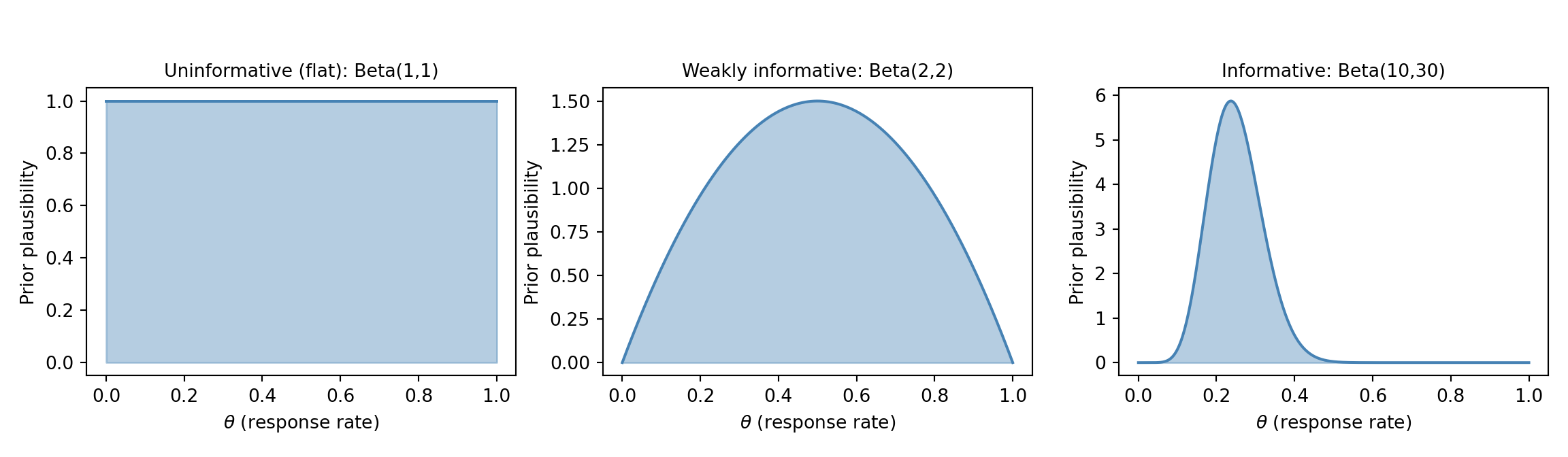
**A concrete clinical setup.** Suppose a new treatment is given to **20 patients and 8 respond**. We want to estimate the true underlying response rate, $\theta$. A natural first guess is simply $8/20 = 40\%$, but with only 20 patients that estimate is shaky, and we may also have prior expectations about the response rate from earlier studies. Bayesian updating lets us combine the two. We will carry this "8 responses in 20 patients" example through the next few sections.
The Beta distribution is parameterised by two shape parameters, $\alpha$ and $\beta$. Loosely, you can read $\alpha$ as a count of "prior successes" and $\beta$ as "prior failures" --- so larger values mean a more confident (narrower) prior:
- $\text{Beta}(1, 1)$ --- uniform on [0, 1], an uninformative prior (no opinion).
- $\text{Beta}(2, 2)$ --- a gentle hump centred at 0.5, weakly informative.
- $\text{Beta}(10, 30)$ --- centred at 0.25, moderately informative (e.g., prior belief that the response rate is around 25%).
The updating rule is beautifully simple. If the prior is $\text{Beta}(\alpha_0, \beta_0)$ and we observe $y$ successes in $n$ trials, the posterior is:
$$
\theta \mid y \sim \text{Beta}(\alpha_0 + y, \; \beta_0 + n - y)
$$
In words: **add your observed successes to $\alpha$ and your observed failures to $\beta$.** For our example ($y = 8$ responses, $n - y = 12$ non-responses), a weakly-informative $\text{Beta}(2,2)$ prior becomes a $\text{Beta}(2+8,\; 2+12) = \text{Beta}(10, 14)$ posterior --- the data have been folded directly into the belief.
::: {.panel-tabset}
### R
```{r}
#| label: fig-beta-priors
#| fig-cap: "Three Beta priors and their posteriors after observing 8 responses in 20 patients."
#| fig-width: 10
#| fig-height: 5
library(tidyverse)

# Observed data: 8 successes out of 20 trials
y <- 8; n <- 20

# Define three priors (factor levels fix the facet order:
# uninformative -> weakly informative -> informative)
prior_levels <- c("Uninformative: Beta(1,1)",
                  "Weakly informative: Beta(2,2)",
                  "Informative: Beta(10,30)")
priors <- tibble(
  prior_name = factor(prior_levels, levels = prior_levels),
  alpha0 = c(1, 2, 10),
  beta0  = c(1, 2, 30)
)

theta <- seq(0, 1, length.out = 500)

# Build plotting data
plot_data <- priors %>%
  rowwise() %>%
  reframe(
    prior_name = prior_name,
    theta = theta,
    Prior     = dbeta(theta, alpha0, beta0),
    Posterior = dbeta(theta, alpha0 + y, beta0 + n - y)
  ) %>%
  pivot_longer(cols = c(Prior, Posterior),
               names_to = "Distribution", values_to = "Density") %>%
  mutate(prior_name = factor(prior_name, levels = prior_levels))

ggplot(plot_data, aes(x = theta, y = Density, colour = Distribution,
                       linetype = Distribution)) +
  geom_line(linewidth = 1) +
  facet_wrap(~ prior_name, scales = "free_y") +
  scale_colour_manual(values = c("Prior" = "steelblue", "Posterior" = "firebrick")) +
  labs(x = expression(theta ~ "(response rate)"),
       y = "Density",
       title = "Effect of Prior Choice on the Posterior",
       subtitle = "Data: 8/20 patients responded") +
  theme_minimal(base_size = 13) +
  theme(legend.position = "bottom")
```
### Python
```{python}
#| label: fig-beta-priors-py
#| fig-cap: "Three Beta priors and their posteriors after observing 8 responses in 20 patients."
import numpy as np
import matplotlib.pyplot as plt
from scipy.stats import beta

y, n = 8, 20
theta = np.linspace(0, 1, 500)

priors = [
    ("Uninformative: Beta(1,1)", 1, 1),
    ("Weakly informative: Beta(2,2)", 2, 2),
    ("Informative: Beta(10,30)", 10, 30),
]

fig, axes = plt.subplots(1, 3, figsize=(14, 4), sharey=False)

for ax, (name, a0, b0) in zip(axes, priors):
    prior_density = beta.pdf(theta, a0, b0)
    post_density  = beta.pdf(theta, a0 + y, b0 + n - y)
    ax.plot(theta, prior_density, label="Prior", color="steelblue", linewidth=1.5)
    ax.plot(theta, post_density, label="Posterior", color="firebrick", linewidth=1.5)
    ax.set_title(name, fontsize=10)
    ax.set_xlabel(r"$\theta$ (response rate)")
    ax.set_ylabel("Density")
    ax.legend(fontsize=9)

fig.suptitle("Effect of Prior Choice on the Posterior\nData: 8/20 patients responded",
             fontsize=12, y=1.04)
plt.tight_layout()
plt.show()
```
:::
Notice what happens with only **20 patients** --- a small sample. The choice of prior visibly matters: with the uninformative $\text{Beta}(1,1)$ and weakly-informative $\text{Beta}(2,2)$ priors, the posterior sits close to the observed rate of $8/20 = 0.40$, but with the informative $\text{Beta}(10,30)$ prior the posterior is clearly **pulled down toward the prior's expectation of 0.25**. With this little data, the prior is not overwhelmed --- it leaves a real fingerprint on the answer.
This cuts both ways, and it is the key practical lesson. When data are scarce, the prior carries real weight, so it must be chosen and justified carefully (and you should always check how much the conclusions shift under different reasonable priors --- a *sensitivity analysis*). It is only as the sample size grows *much larger* that the likelihood dominates and the posterior becomes insensitive to the prior --- the regime where "the data overwhelm the prior." Twenty patients is firmly in the small-sample regime, which is exactly why Bayesian methods, with a sensible prior, are so useful here in the first place.
## The Likelihood
The likelihood answers a simple question: *for each possible value of the true response rate $\theta$, how well does it explain the data we actually saw?* Written $P(D \mid \theta)$, it is the same quantity that appears in maximum likelihood estimation (MLE) --- but in the Bayesian framework we *combine* it with the prior rather than maximising it on its own.
For our example of 8 responses in 20 patients, the likelihood is given by the **binomial formula**:
$$
L(\theta) = \underbrace{\binom{20}{8}}_{\substack{\text{number of ways}\\ \text{8 of 20 could respond}}} \; \underbrace{\theta^{8}}_{\substack{\text{8 patients}\\ \text{responded}}} \; \underbrace{(1-\theta)^{12}}_{\substack{\text{12 did}\\ \text{not respond}}}
$$
You will likely not have met this formula before, and you do not need to memorise it --- but the idea behind it is intuitive. If the true response rate were $\theta$, then the chance that any one patient responds is $\theta$ and the chance they do not is $(1-\theta)$. To get *8 responders and 12 non-responders*, we multiply $\theta$ eight times and $(1-\theta)$ twelve times; the $\binom{20}{8}$ term simply counts the many different orders in which those 8 responses could have occurred among the 20 patients. Plug in a candidate rate --- say $\theta = 0.4$ --- and the formula tells you how likely "8 out of 20" is under that rate.
The likelihood is largest at $\hat{\theta}_{\text{MLE}} = 8/20 = 0.40$ --- exactly the observed proportion, which makes sense: the rate that best explains "8 of 20" is 40%. The Bayesian posterior will sit near this value but be pulled slightly toward the prior --- a sensible compromise between what the data say and what we believed beforehand, known as **shrinkage**.
## The Posterior Distribution
The posterior is the complete answer to a Bayesian analysis. It is not a single number; it is a full probability distribution over the parameter. From the posterior you can extract:
- **Point estimates**: the posterior mean, median, or mode.
- **Credible intervals**: ranges containing the parameter with a specified probability.
- **Probabilities of hypotheses**: e.g., $P(\theta > 0.3 \mid \text{data})$.
### Credible Intervals vs Confidence Intervals
This distinction is critical and frequently confused.
**A 95% frequentist confidence interval** means: if the experiment were repeated many times, 95% of the computed intervals would contain the true parameter. It does **not** mean there is a 95% probability the true parameter is in *this* interval.
**A 95% Bayesian credible interval** means: given the data and the model, there is a 95% probability that the parameter lies in this interval.
The Bayesian credible interval says what most people *think* a confidence interval says. This interpretability is one of the major practical advantages of Bayesian inference.
::: {.panel-tabset}
### R
```{r}
#| label: credible-interval-demo
# Posterior from weakly informative prior Beta(2,2) + data (8/20)
alpha_post <- 2 + 8
beta_post  <- 2 + 12

# 95% credible interval (equal-tailed)
ci_95 <- qbeta(c(0.025, 0.975), alpha_post, beta_post)
cat("Posterior mean:", alpha_post / (alpha_post + beta_post), "\n")
cat("95% credible interval:", round(ci_95, 3), "\n")
# Probability that response rate exceeds 30%
prob_gt_30 <- 1 - pbeta(0.30, alpha_post, beta_post)
cat("P(theta > 0.30 | data):", round(prob_gt_30, 3), "\n")
```
### Python
```{python}
from scipy.stats import beta

alpha_post = 2 + 8
beta_post  = 2 + 12

ci_95 = beta.ppf([0.025, 0.975], alpha_post, beta_post)
print(f"Posterior mean: {alpha_post / (alpha_post + beta_post):.3f}")
print(f"95% credible interval: [{ci_95[0]:.3f}, {ci_95[1]:.3f}]")
prob_gt_30 = 1 - beta.cdf(0.30, alpha_post, beta_post)
print(f"P(theta > 0.30 | data): {prob_gt_30:.3f}")
```
:::
## Markov Chain Monte Carlo (MCMC)
Before the mechanics, some context --- because this is where Bayesian analysis starts to feel unfamiliar to most clinicians. So far, our "8 of 20" example had a tidy shortcut: because the Beta prior pairs perfectly with the binomial likelihood (the conjugacy trick from earlier), we could write the posterior down with simple arithmetic and no computer simulation. That shortcut is the exception, not the rule.
### Why We Need It
The Beta-Binomial example above had a **neat closed-form answer** --- we could compute the posterior with pen and paper because the Beta prior is conjugate to the binomial likelihood. But that convenience disappears as soon as a model becomes realistic. A clinical prediction model with age, sex, blood pressure, cholesterol, and a dozen other predictors has many parameters and no conjugate shortcut, so there is **no formula** for the posterior --- you cannot simply write it down.
This is the practical problem MCMC solves, and it is worth stating plainly because it is genuinely new territory: instead of computing the posterior with a formula, we **let the computer draw thousands of samples from it** and then describe those samples (their average, their spread, their 95% range). It is the same logic as estimating a population by taking a large random sample --- except here we are "sampling" from a probability distribution we cannot see directly. The key idea: rather than evaluating $P(\theta \mid D)$ everywhere, we construct a guided random walk through parameter space that, over many steps, spends time in each region *in proportion to its posterior probability*. Collect those visited points and you have a picture of the posterior.
You will never do this by hand, and you rarely even write the sampler yourself --- modern software does it for you (see below). The most widely used algorithm today is the **No-U-Turn Sampler (NUTS)**, a refinement of Hamiltonian Monte Carlo (HMC), and it is the default in Stan, brms, rstanarm, and PyMC. What you *do* need to understand as a user is (1) what the samples represent and (2) how to check the sampler worked --- which is what the next two sections cover.
### How It Works Conceptually
The algorithm is a guided exploration of parameter space. Picture a hiker trying to map out where a mountain range is tallest, but in fog --- they can only feel whether a step takes them uphill or downhill. The "height" here is the **posterior density**: how plausible a parameter value is, given the prior and the data combined. The sampler walks around, preferring to spend time on the high ground (plausible values) but occasionally wandering into the lowlands, and records every spot it stands on. Concretely:
1. **Start** at some initial parameter value $\theta_0$.
2. **Propose** a nearby candidate value $\theta^{*}$.
3. **Compare the posterior density** at $\theta^{*}$ versus the current spot $\theta_0$ --- i.e. ask "is this candidate more or less plausible, given prior + data?"
4. **Accept or reject**: if $\theta^{*}$ is more plausible, move there; if less plausible, move there only *sometimes* (with a probability equal to how much less plausible it is). This "sometimes accept a worse spot" rule is what stops the chain getting stuck on one peak and lets it map the whole posterior.
5. **Repeat** thousands of times, writing down every value visited.
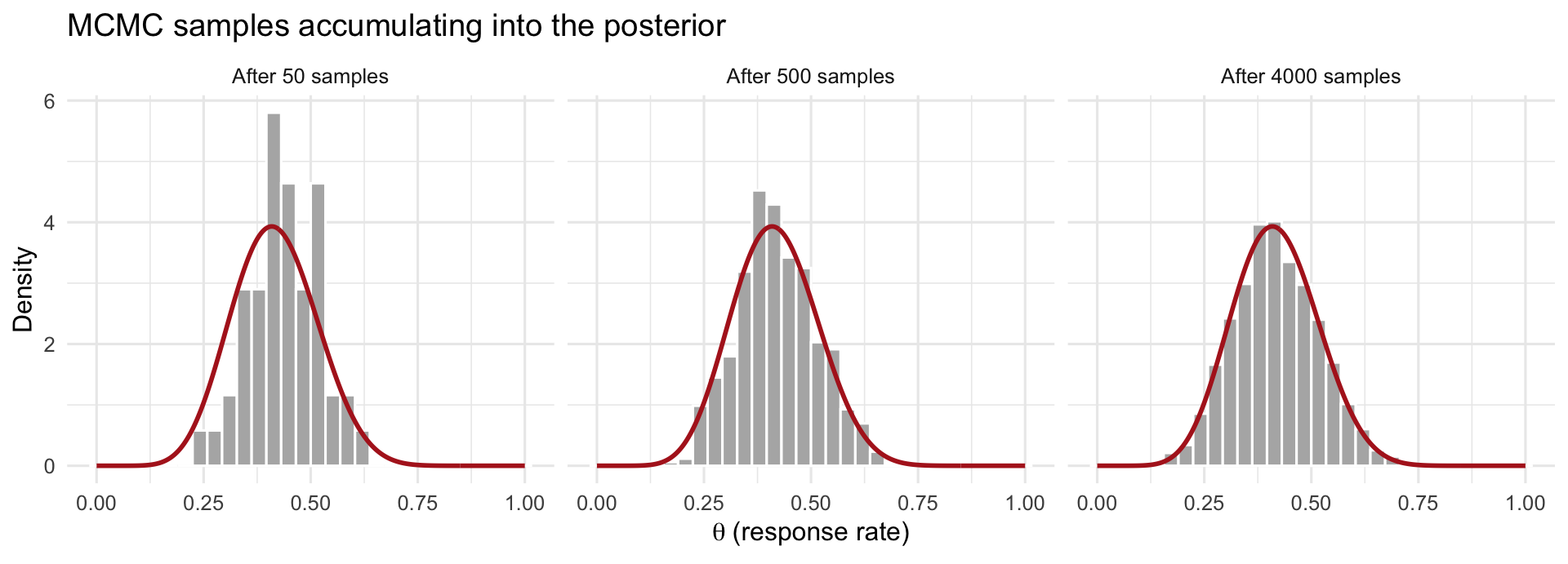
The crucial payoff is in step 4: because the walk lingers on high-density regions in proportion to their plausibility, the **collection of recorded values is itself a sample from the posterior**. You never computed the posterior formula --- you reconstructed it from where the sampler spent its time. Pile those recorded values into a histogram and it traces out the posterior distribution, as the figure below shows. We typically run several independent chains (e.g., 4) from different starting points and discard each chain's initial **"warm-up"** period, during which it is still finding its way to the high-density region.
::: {.panel-tabset}
#### R
```{r}
#| label: fig-mcmc-posterior-build
#| fig-cap: "How MCMC reconstructs a posterior. Each grey histogram is the collection of values the sampler has visited so far; as more samples accumulate (left to right), the histogram fills in the true posterior density (red curve) it was never given as a formula."
#| fig-width: 10
#| fig-height: 3.6
library(tidyverse)

# Target posterior for the 8/20 example with a Beta(2,2) prior: Beta(10, 14)
a_post <- 10; b_post <- 14

# Draw samples from the posterior (in practice MCMC would generate these;
# here we sample directly to illustrate what the accumulating draws look like)
set.seed(1)
draws <- rbeta(4000, a_post, b_post)

theta <- seq(0, 1, length.out = 300)
true_curve <- tibble(theta = theta, density = dbeta(theta, a_post, b_post))

stages <- c(50, 500, 4000)
hist_data <- map_dfr(stages, function(k) {
  tibble(n_samples = paste0("After ", k, " samples"), theta = draws[1:k])
}) %>%
  mutate(n_samples = factor(n_samples,
           levels = paste0("After ", stages, " samples")))

ggplot(hist_data, aes(theta)) +
  geom_histogram(aes(y = after_stat(density)), bins = 30,
                 fill = "grey70", colour = "white") +
  geom_line(data = expand_grid(n_samples = factor(paste0("After ", stages, " samples"),
                                 levels = paste0("After ", stages, " samples")),
                               true_curve),
            aes(theta, density), colour = "firebrick", linewidth = 1) +
  facet_wrap(~ n_samples) +
  labs(x = expression(theta ~ "(response rate)"), y = "Density",
       title = "MCMC samples accumulating into the posterior") +
  theme_minimal(base_size = 12)
```
#### Python
```{python}
#| label: fig-mcmc-posterior-build-py
#| fig-cap: "How MCMC reconstructs a posterior. As more samples accumulate (left to right), the histogram of visited values fills in the true posterior density (red curve)."
#| fig-width: 10
#| fig-height: 3.6
import numpy as np
import matplotlib.pyplot as plt
from scipy.stats import beta

a_post, b_post = 10, 14
rng = np.random.default_rng(1)
draws = rng.beta(a_post, b_post, size=4000)
theta = np.linspace(0, 1, 300)
true_curve = beta.pdf(theta, a_post, b_post)

stages = [50, 500, 4000]
fig, axes = plt.subplots(1, 3, figsize=(12, 3.6), sharex=True)
for ax, k in zip(axes, stages):
    ax.hist(draws[:k], bins=30, density=True, color="grey", alpha=0.6,
            edgecolor="white")
    ax.plot(theta, true_curve, color="firebrick", linewidth=1.5)
    ax.set_title(f"After {k} samples", fontsize=10)
    ax.set_xlabel(r"$\theta$ (response rate)")
axes[0].set_ylabel("Density")
fig.suptitle("MCMC samples accumulating into the posterior", fontsize=12, y=1.04)
plt.tight_layout()
plt.show()
```
:::
### Diagnosing Convergence
MCMC hands you an answer, but you should not trust it blindly --- the sampler can fail to explore the posterior properly, in which case the summaries are wrong. Fortunately, checking is quick: the software prints these diagnostics automatically, and you mainly need to recognise a green light from a red flag. There are three to know, and all three must look good before you believe the results. This is unfamiliar territory if you come from ordinary regression (where there is nothing analogous to "did the fitting algorithm converge?"), so here is each one in plain terms.
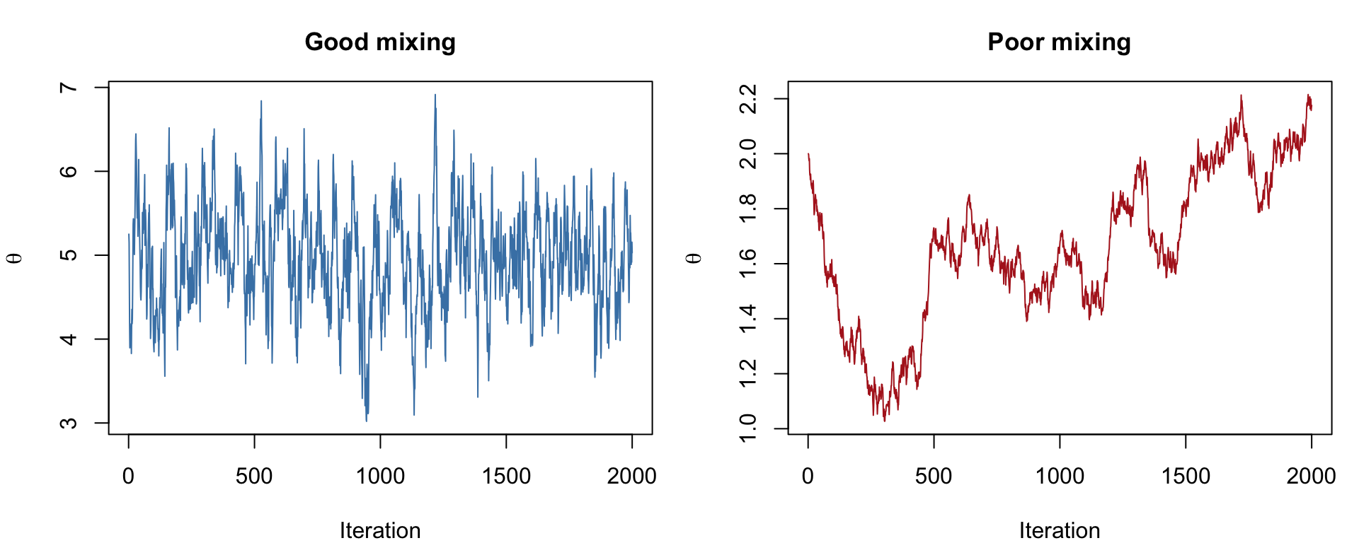
**Trace plots --- "did the chains explore freely?"** A trace plot draws each chain's sampled value against the iteration number. You want it to look like a **"fuzzy caterpillar"**: a dense, flat, fuzzy band where all the chains overlap and rapidly zig-zag across the same range, with no drift up or down. That tells you the chains settled into the same region and explored it thoroughly. **Red flags**: a chain that wanders off on its own, drifts steadily in one direction, or gets "stuck" flat for long stretches --- any of these means it has not converged. (The earlier figure contrasts good and poor mixing.)
**$\hat{R}$ (R-hat) --- "do the separate chains agree?"** We run several chains from different starting points; if they have all found the same posterior, they should look interchangeable. $\hat{R}$ measures exactly that, by comparing the spread *within* each chain to the spread *between* chains. If they agree, $\hat{R} \approx 1.0$. **Rule of thumb**: $\hat{R} < 1.01$ is reassuring; values above ~1.05 signal a real problem --- the chains disagree, so do not trust the estimates. The fix is usually to run the chains longer or reconsider the model.
**Effective sample size (ESS) --- "how much independent information do I really have?"** Consecutive MCMC draws are correlated (each step is near the last), so 4,000 draws carry *less* information than 4,000 truly independent ones --- they might be worth only, say, 1,000. ESS estimates that equivalent number of independent draws. A small ESS means your reported posterior mean and 95% interval are themselves noisy. **Rule of thumb**: aim for ESS in the high hundreds or more (≳ 400) for both the central estimate and the interval limits; if it is low, run more iterations.
In practice you glance at all three after every fit: trace plots fuzzy and overlapping, every $\hat{R} \approx 1.00$, and ESS comfortably in the hundreds. Only then do you read off the posterior.
::: {.panel-tabset}
### R
```{r}
#| label: fig-mcmc-demo
#| fig-cap: "Simulated MCMC trace plots: a well-behaved chain (left) and a poorly-mixing chain (right)."
#| fig-width: 10
#| fig-height: 4
set.seed(42)

# Simulate a well-behaved chain (approximately normal draws)
good_chain <- cumsum(rnorm(2000, 0, 0.1)) * 0
good_chain[1] <- rnorm(1, 5, 1)
for (i in 2:2000) {
  good_chain[i] <- good_chain[i-1] + rnorm(1, 0, 0.3)
  # Metropolis-like: pull toward mean of 5
  good_chain[i] <- good_chain[i] + 0.1 * (5 - good_chain[i])
}

# Simulate a poorly-mixing chain (high autocorrelation)
bad_chain <- numeric(2000)
bad_chain[1] <- 2
for (i in 2:2000) {
  bad_chain[i] <- bad_chain[i-1] + rnorm(1, 0, 0.02)
}

par(mfrow = c(1, 2), mar = c(4, 4, 3, 1))
plot(good_chain, type = "l", col = "steelblue",
     main = "Good mixing", xlab = "Iteration", ylab = expression(theta),
     cex.main = 1.1)
plot(bad_chain, type = "l", col = "firebrick",
     main = "Poor mixing", xlab = "Iteration", ylab = expression(theta),
     cex.main = 1.1)
```
### Python
```{python}
#| label: fig-mcmc-demo-py
#| fig-cap: "Simulated MCMC trace plots: a well-behaved chain (left) and a poorly-mixing chain (right)."
import numpy as np
import matplotlib.pyplot as plt

np.random.seed(42)

# Good chain: rapidly mixing
good_chain = np.zeros(2000)
good_chain[0] = np.random.normal(5, 1)
for i in range(1, 2000):
    good_chain[i] = good_chain[i-1] + np.random.normal(0, 0.3)
    good_chain[i] += 0.1 * (5 - good_chain[i])

# Bad chain: high autocorrelation, slow drift
bad_chain = np.zeros(2000)
bad_chain[0] = 2.0
for i in range(1, 2000):
    bad_chain[i] = bad_chain[i-1] + np.random.normal(0, 0.02)

fig, axes = plt.subplots(1, 2, figsize=(12, 4))
axes[0].plot(good_chain, color="steelblue", linewidth=0.5)
axes[0].set_title("Good mixing")
axes[0].set_xlabel("Iteration")
axes[0].set_ylabel(r"$\theta$")

axes[1].plot(bad_chain, color="firebrick", linewidth=0.5)
axes[1].set_title("Poor mixing")
axes[1].set_xlabel("Iteration")
axes[1].set_ylabel(r"$\theta$")

plt.tight_layout()
plt.show()
```
:::
### A first taste of Bayesian software
You do not need to write MCMC samplers yourself. Modern software handles this entirely. Here is what fitting a Bayesian logistic regression looks like in practice, using the Framingham heart-study data (10-year coronary heart disease as the outcome). The first line loads the dataset --- without it, `framingham` would not exist and the fit would fail:
::: {.panel-tabset}
## R
```{r}
#| eval: false
library(rstanarm)

# Load the data first (CSV included with the course materials)
framingham <- read.csv("data/framingham.csv")

fit <- stan_glm(chd_10yr ~ age + sex + smoking,
                data = framingham,
                family = binomial(),
                prior = normal(0, 2.5),  # weakly informative
                chains = 4, iter = 2000, seed = 42)
summary(fit)
```
## Python
```{python}
#| eval: false
import pandas as pd
import bambi as bmb

# Load the data first (CSV included with the course materials)
framingham = pd.read_csv("data/framingham.csv")

model = bmb.Model("chd_10yr ~ age + sex + smoking",
                   data=framingham, family="bernoulli")
results = model.fit(draws=2000, chains=4, random_seed=42)
results.summary()
```
:::
The next chapter covers this in full detail, including how to check your model and interpret the output.
## When Bayesian Methods Add Value
Bayesian inference is not always necessary, but there are situations where it provides genuine advantages over frequentist methods:
**Small samples.** When data are scarce (rare diseases, paediatric populations, early-phase trials), informative priors allow you to borrow strength from previous studies. A frequentist analysis of 12 patients yields wide confidence intervals and little power; a Bayesian analysis that incorporates prior evidence can produce more precise and clinically useful estimates.
**Prior evidence is available.** If there are five previous randomised trials of a drug, it would be wasteful to ignore that evidence when analysing a sixth. Bayesian methods provide a principled framework for incorporating it.
**Rare events.** When estimating the probability of a rare adverse event (e.g., 0 events in 200 patients), the frequentist MLE is zero --- clearly an underestimate. A Bayesian analysis with an appropriate prior yields a plausible non-zero estimate.
**Sequential updating.** In adaptive clinical trials, data are analysed repeatedly as they accumulate. Bayesian methods handle this naturally: today's posterior becomes tomorrow's prior. Frequentist methods require complex corrections for multiple looks at the data.
**Direct probability statements.** Clinicians want to know "what is the probability that this treatment is effective?" Bayesian methods answer that question directly: $P(\text{treatment effect} > 0 \mid \text{data})$.
::: {.callout-important}
## Bayesian methods are not a magic fix
Bayesian inference does not rescue a poorly designed study, does not eliminate bias, and does not make small samples equivalent to large ones. The prior helps, but it also introduces subjectivity. Sensitivity analyses showing how results change under different priors are essential.
:::
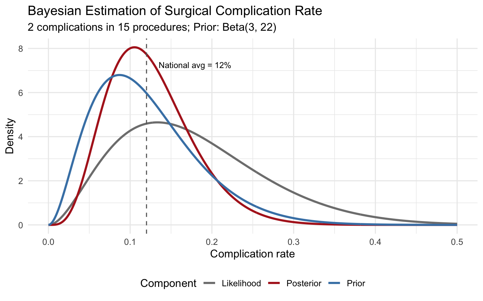
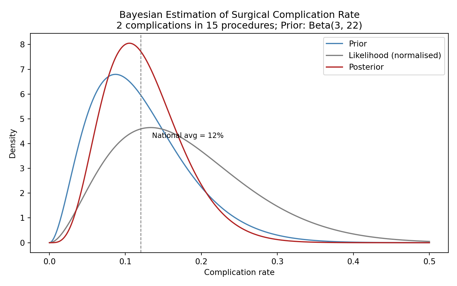
## Practical Example: Estimating a Surgical Complication Rate
A hospital performs a new minimally invasive cardiac procedure. In the first 15 cases, 2 patients experience a major complication. The national average for the traditional open procedure is approximately 12%. What can we say about this hospital's complication rate?
::: {.panel-tabset}
### R
```{r}
#| label: fig-surgical-posterior
#| fig-cap: "Posterior distribution for the complication rate of a new surgical procedure."
#| fig-width: 8
#| fig-height: 5
# Data
y <- 2   # complications
n <- 15  # procedures

# Prior: weakly informative, centred near the national average of 12%
# Beta(3, 22) has mean 3/25 = 0.12 and is moderately concentrated
alpha_prior <- 3
beta_prior  <- 22

# Posterior
alpha_post <- alpha_prior + y
beta_post  <- beta_prior + n - y

theta <- seq(0, 0.5, length.out = 500)

plot_df <- tibble(
  theta = theta,
  Prior     = dbeta(theta, alpha_prior, beta_prior),
  Likelihood = dbeta(theta, y + 1, n - y + 1),  # normalised for visualisation
  Posterior = dbeta(theta, alpha_post, beta_post)
) %>%
  pivot_longer(-theta, names_to = "Component", values_to = "Density")

ggplot(plot_df, aes(x = theta, y = Density, colour = Component)) +
  geom_line(linewidth = 1.2) +
  scale_colour_manual(values = c("Prior" = "steelblue",
                                  "Likelihood" = "grey50",
                                  "Posterior" = "firebrick")) +
  labs(x = "Complication rate",
       y = "Density",
       title = "Bayesian Estimation of Surgical Complication Rate",
       subtitle = "2 complications in 15 procedures; Prior: Beta(3, 22)") +
  geom_vline(xintercept = 0.12, linetype = "dashed", colour = "grey40") +
  annotate("text", x = 0.135, y = max(dbeta(theta, alpha_post, beta_post)) * 0.9,
           label = "National avg = 12%", size = 3.5, hjust = 0) +
  theme_minimal(base_size = 13) +
  theme(legend.position = "bottom")

# Posterior summaries
cat("Posterior mean:", round(alpha_post / (alpha_post + beta_post), 3), "\n")
cat("95% credible interval:",
    round(qbeta(c(0.025, 0.975), alpha_post, beta_post), 3), "\n")
cat("P(rate > 0.20 | data):",
    round(1 - pbeta(0.20, alpha_post, beta_post), 3), "\n")
```
### Python
```{python}
#| label: fig-surgical-posterior-py
#| fig-cap: "Posterior distribution for the complication rate of a new surgical procedure."
import numpy as np
import matplotlib.pyplot as plt
from scipy.stats import beta

y, n = 2, 15
alpha_prior, beta_prior = 3, 22
alpha_post = alpha_prior + y
beta_post_ = beta_prior + n - y

theta = np.linspace(0, 0.5, 500)

fig, ax = plt.subplots(figsize=(8, 5))
ax.plot(theta, beta.pdf(theta, alpha_prior, beta_prior),
        label="Prior", color="steelblue", linewidth=1.5)
ax.plot(theta, beta.pdf(theta, y + 1, n - y + 1),
        label="Likelihood (normalised)", color="grey", linewidth=1.5)
ax.plot(theta, beta.pdf(theta, alpha_post, beta_post_),
        label="Posterior", color="firebrick", linewidth=1.5)
ax.axvline(0.12, linestyle="--", color="grey", linewidth=1)
ax.text(0.135, ax.get_ylim()[1] * 0.5, "National avg = 12%", fontsize=9)
ax.set_xlabel("Complication rate")
ax.set_ylabel("Density")
ax.set_title("Bayesian Estimation of Surgical Complication Rate\n"
             "2 complications in 15 procedures; Prior: Beta(3, 22)")
ax.legend()
plt.tight_layout()
plt.show()
ci = beta.ppf([0.025, 0.975], alpha_post, beta_post_)
print(f"Posterior mean: {alpha_post / (alpha_post + beta_post_):.3f}")
print(f"95% credible interval: [{ci[0]:.3f}, {ci[1]:.3f}]")
print(f"P(rate > 0.20 | data): {1 - beta.cdf(0.20, alpha_post, beta_post_):.3f}")
```
:::
The posterior mean is pulled between the MLE (2/15 = 0.133) and the prior mean (0.12), settling near 0.125. With only 15 observations, the prior meaningfully influences the result --- and that is appropriate, because we have genuine prior information about surgical complication rates.
## Exercises
### Exercise 1: Diagnostic Test Updating
A screening mammogram has a sensitivity of 90% and a specificity of 92%. Among women aged 50--59, the prevalence of breast cancer is approximately 2%.
a. Calculate the posterior probability of breast cancer given a positive mammogram using Bayes' theorem.
b. If the patient then receives a confirmatory ultrasound (sensitivity 95%, specificity 85%), use the posterior from (a) as the new prior and calculate the updated posterior probability after a positive ultrasound.
c. What does this sequential updating illustrate about the Bayesian framework?
::: {.panel-tabset}
### R
```{r}
#| label: exercise-1-solution
#| code-fold: true
#| code-summary: "Show solution"
# Part (a): Mammogram
sens_mammo <- 0.90
spec_mammo <- 0.92
prevalence <- 0.02

post_mammo <- (sens_mammo * prevalence) /
  (sens_mammo * prevalence + (1 - spec_mammo) * (1 - prevalence))
cat("P(cancer | positive mammogram):", round(post_mammo, 4), "\n")
# Part (b): Ultrasound, using posterior from (a) as new prior
sens_us <- 0.95
spec_us <- 0.85
prior_us <- post_mammo

post_us <- (sens_us * prior_us) /
  (sens_us * prior_us + (1 - spec_us) * (1 - prior_us))
cat("P(cancer | positive mammogram AND positive ultrasound):",
    round(post_us, 4), "\n")
```
### Python
```{python}
#| label: exercise-1-solution-py
#| code-fold: true
#| code-summary: "Show solution"
# Part (a)
sens_mammo, spec_mammo, prevalence = 0.90, 0.92, 0.02
post_mammo = (sens_mammo * prevalence) / \
    (sens_mammo * prevalence + (1 - spec_mammo) * (1 - prevalence))
print(f"P(cancer | positive mammogram): {post_mammo:.4f}")
# Part (b)
sens_us, spec_us = 0.95, 0.85
post_us = (sens_us * post_mammo) / \
    (sens_us * post_mammo + (1 - spec_us) * (1 - post_mammo))
print(f"P(cancer | pos mammo AND pos ultrasound): {post_us:.4f}")
```
:::
### Exercise 2: Prior Sensitivity Analysis
A Phase II trial of a new antibiotic enrols 30 patients with resistant urinary tract infections. Twenty-one patients achieve clinical cure.
a. Using three different priors --- Beta(1,1), Beta(5,5), and Beta(20,10) --- compute the posterior mean and 95% credible interval for the cure rate.
b. Plot all three posteriors on the same graph.
c. Which prior has the most influence on the posterior? Why?
::: {.panel-tabset}
### R
```{r}
#| label: exercise-2-solution
#| code-fold: true
#| code-summary: "Show solution"
#| fig-width: 8
#| fig-height: 5
y <- 21; n <- 30
priors <- list(
  list(name = "Beta(1,1)", a = 1, b = 1),
  list(name = "Beta(5,5)", a = 5, b = 5),
  list(name = "Beta(20,10)", a = 20, b = 10)
)

theta <- seq(0, 1, length.out = 500)
plot_df <- tibble()

for (p in priors) {
  a_post <- p$a + y
  b_post <- p$b + n - y
  ci <- qbeta(c(0.025, 0.975), a_post, b_post)
  cat(sprintf("%s -> Posterior mean: %.3f, 95%% CI: [%.3f, %.3f]\n",
              p$name, a_post / (a_post + b_post), ci[1], ci[2]))
  plot_df <- bind_rows(plot_df,
    tibble(theta = theta, Density = dbeta(theta, a_post, b_post),
           Prior = p$name))
}
ggplot(plot_df, aes(x = theta, y = Density, colour = Prior)) +
  geom_line(linewidth = 1.2) +
  labs(x = "Cure rate", y = "Density",
       title = "Posterior Distributions Under Different Priors",
       subtitle = "21/30 patients cured") +
  theme_minimal(base_size = 13) +
  theme(legend.position = "bottom")
```
### Python
```{python}
#| label: exercise-2-solution-py
#| code-fold: true
#| code-summary: "Show solution"
import numpy as np
import matplotlib.pyplot as plt
from scipy.stats import beta

y, n = 21, 30
priors = [("Beta(1,1)", 1, 1), ("Beta(5,5)", 5, 5), ("Beta(20,10)", 20, 10)]
theta = np.linspace(0, 1, 500)

fig, ax = plt.subplots(figsize=(8, 5))
for name, a0, b0 in priors:
    a_post, b_post = a0 + y, b0 + n - y
    ci = beta.ppf([0.025, 0.975], a_post, b_post)
    mean_post = a_post / (a_post + b_post)
    print(f"{name} -> Mean: {mean_post:.3f}, 95% CI: [{ci[0]:.3f}, {ci[1]:.3f}]")
    ax.plot(theta, beta.pdf(theta, a_post, b_post), label=name, linewidth=1.5)

ax.set_xlabel("Cure rate")
ax.set_ylabel("Density")
ax.set_title("Posterior Distributions Under Different Priors\n21/30 patients cured")
ax.legend()
plt.tight_layout()
plt.show()
```
:::
### Exercise 3: Interpreting MCMC Diagnostics
You fit a Bayesian logistic regression model and obtain the following diagnostics for the treatment effect parameter:
- Chain 1 R-hat: 1.08
- Chain 2 R-hat: 1.08
- Bulk ESS: 150
- Tail ESS: 85
- The trace plot shows two chains that appear to be exploring different regions of the parameter space.
a. Is there evidence of convergence problems? Explain which diagnostics are concerning and why.
b. What steps would you take to fix these problems?
c. Would you trust the posterior summaries from this model? Why or why not?
## Summary
Bayesian inference provides a coherent framework for updating beliefs in light of evidence. Its core components --- the prior, the likelihood, and the posterior --- are connected by Bayes' theorem. While simple conjugate models (like Beta-Binomial) can be solved analytically, most real-world models require MCMC sampling. The key practical advantages of Bayesian methods include direct probability statements, principled incorporation of prior knowledge, and natural handling of sequential data --- all of which are particularly valuable in clinical research.
In the next chapter, we will move from theory to practice: fitting Bayesian regression and hierarchical models using modern software.
::: {.callout-tip}
## Key Takeaways
1. Bayesian inference treats parameters as uncertain and data as fixed --- the reverse of frequentist thinking.
2. The posterior is proportional to the likelihood times the prior.
3. Credible intervals have the intuitive interpretation people mistakenly attribute to confidence intervals.
4. MCMC allows us to sample from complex posteriors; always check convergence with trace plots, R-hat, and ESS.
5. Bayesian methods shine when samples are small, prior evidence exists, or direct probability statements are needed.
:::
## References and Further Reading
The foundational textbook for applied Bayesian analysis is McElreath's *Statistical Rethinking* (2nd edition, 2020), which teaches Bayesian inference through simulation and coding rather than mathematical derivation. It is highly recommended for students coming from a non-statistical background. For a more comprehensive and mathematically rigorous treatment, Gelman, Carlin, Stern, Dunson, Vehtari, and Rubin's *Bayesian Data Analysis* (3rd edition, 2013), commonly known as BDA3, remains the standard reference; a free PDF is available from the authors' website. Kruschke's *Doing Bayesian Data Analysis* (2nd edition, 2015) offers a gentle introduction with extensive worked examples in R.
For the clinical and regulatory context, the FDA's 2010 guidance document *Guidance for the Use of Bayesian Statistics in Medical Device Clinical Trials* provides a framework for incorporating Bayesian methods in regulatory submissions, and updated guidance released in 2026 reflects the growing acceptance of Bayesian adaptive designs. Spiegelhalter, Abrams, and Myles' *Bayesian Approaches to Clinical Trials and Health-Care Evaluation* (2004) is particularly relevant for public health students, covering prior elicitation, adaptive designs, and cost-effectiveness analysis. The Stan Development Team's documentation (mc-stan.org) includes excellent case studies and practical tutorials that complement any of the above textbooks.