---
execute:
eval: true
---
# Modelling Non-Linear Relationships: Splines, Fractional Polynomials, and Why Categorisation Fails {#sec-splines}
::: {.callout-note}
## Learning Objectives
By the end of this chapter, you will be able to:
1. Explain why categorising continuous variables leads to information loss and biased estimates
2. Recognise when a linear term is insufficient for modelling a continuous predictor
3. Describe fractional polynomials and their role in flexible modelling
4. Understand how splines work, including the concepts of knots, cubic splines, and restricted cubic splines
5. Implement and interpret restricted cubic spline models in both R and Python
6. Compare linear, categorical, and spline models using appropriate fit statistics
7. Apply the practical recommendations from Lopez-Ayala et al. (2025) in your own analyses
:::
::: {.callout-note title="What is different about this chapter"}
This chapter introduces tools you probably haven't seen before. The pace is faster than the previous chapters, and the concepts (splines, knot placement) may feel unfamiliar. Budget extra time here.
**Why it matters for your research:** If you build a prediction model or run a regression without properly handling continuous variables, your results will be less accurate — or wrong. Systematic reviews show that most published clinical prediction models categorise continuous variables inappropriately. This chapter teaches you the right way.
:::
## Introduction
Imagine you are studying the relationship between body mass index (BMI) and mortality. You have data on thousands of patients, and you need to build a regression model. What do you do with BMI?
If you are like most researchers in clinical medicine, you probably split BMI into categories: underweight (<18.5), normal (18.5--24.9), overweight (25--29.9), and obese (30+). You then include these categories as dummy variables in your regression model. This approach feels natural --- it mirrors how we think clinically, and the results are easy to present in a table.
**This is almost always the wrong approach.**
Categorising continuous variables is one of the most common and most damaging analytic practices in clinical research. It throws away information, introduces bias, reduces statistical power, and can lead to completely wrong conclusions about the shape of relationships between predictors and outcomes.
This chapter draws heavily on a landmark tutorial by Lopez-Ayala et al. [-@lopezayala2025], published in the *BMJ* in 2025, which provides a comprehensive guide to modelling continuous variables correctly. We will follow their framework closely, supplementing it with additional clinical examples and implementation guidance.
## The Problem with Categorising Continuous Variables
### What Happens When You Categorise
When you convert a continuous variable into categories, you make three implicit assumptions, all of which are almost certainly wrong:
1. **Within each category, the relationship is flat.** A patient with a BMI of 18.6 is treated identically to a patient with a BMI of 24.8 --- despite a difference of over 6 kg/m^2^.
2. **At the category boundary, there is a sudden jump.** A patient with a BMI of 24.9 is treated as fundamentally different from a patient with a BMI of 25.0 --- despite a difference of only 0.1 kg/m^2^.
3. **The cut-points are meaningful.** The chosen boundaries (often based on clinical convention or percentiles) capture the true biology of the relationship.
None of these assumptions hold for most biological relationships. Biology is smooth, not stepped.
### The Consequences Are Serious
Lopez-Ayala et al. [-@lopezayala2025] enumerate several consequences of categorisation:
- **Loss of statistical power.** Categorising a continuous variable into two groups is equivalent to discarding roughly one-third of your data [@royston2006]. Even with more categories, substantial information is lost.
- **Biased effect estimates.** Because the relationship within each category is forced to be flat, the estimated effects are systematically wrong. The direction and magnitude of the bias depend on where you place the cut-points.
- **Residual confounding.** When a categorised variable is used as a confounder in an adjusted model, the adjustment is incomplete. The true confounding effect varies smoothly, but your model only adjusts in crude steps. This is sometimes called *residual confounding due to categorisation*.
- **Arbitrary cut-points change conclusions.** Different choices of cut-points can lead to different --- even contradictory --- conclusions from the same data. This is a form of researcher degrees of freedom that inflates false positive rates.
- **Loss of predictive accuracy.** Prediction models that categorise continuous predictors perform worse than those that model them appropriately.
::: {.callout-warning}
## A Common But Flawed Justification
Researchers often justify categorisation by saying "it's easier to interpret" or "clinicians think in categories." While clinical decision-making does involve thresholds (e.g., treat if blood pressure > 140 mmHg), the *modelling* of relationships should reflect reality, not convenience. You can always convert a continuous model's output into clinically actionable categories *after* modelling --- but you cannot recover the information lost by categorising *before* modelling.
:::
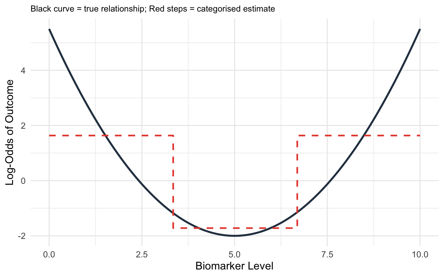
### A Visual Demonstration
Consider the true relationship between a biomarker (say, C-reactive protein) and the log-odds of a diagnosis. Suppose the true relationship is U-shaped: both very low and very high values are associated with increased risk.
If you categorise CRP into tertiles (low, medium, high), you will estimate a *monotonically increasing* relationship --- completely missing the U-shape. The low-risk group is contaminated by some high-risk individuals at the low end, and the comparison between groups obscures the smooth curve.
```{r}
#| label: fig-categorisation-problem
#| fig-cap: "True non-linear relationship (solid curve) versus what categorisation into tertiles recovers (stepped line). Categorisation misses the U-shape entirely."
#| code-fold: true
#| warning: false
library(ggplot2)

set.seed(42)
x <- seq(0, 10, length.out = 300)
# True U-shaped relationship
y_true <- 0.3 * (x - 5)^2 - 2

df <- data.frame(x = x, y_true = y_true)

# Categorise into tertiles
df$category <- cut(df$x, breaks = quantile(df$x, probs = c(0, 1/3, 2/3, 1)),
                   include.lowest = TRUE, labels = c("Low", "Medium", "High"))
cat_means <- aggregate(y_true ~ category, data = df, FUN = mean)

df$y_cat <- cat_means$y_true[match(df$category, cat_means$category)]

ggplot(df, aes(x = x)) +
  geom_line(aes(y = y_true), linewidth = 1.2, colour = "#2c3e50") +
  geom_step(aes(y = y_cat), linewidth = 1, colour = "#e74c3c", linetype = "dashed") +
  labs(x = "Biomarker Level", y = "Log-Odds of Outcome",
       subtitle = "Black curve = true relationship; Red steps = categorised estimate") +
  theme_minimal(base_size = 14) +
  theme(plot.subtitle = element_text(size = 11))
```
## When Linear Terms Are Not Enough
### The Linearity Assumption
In standard logistic or linear regression, including a continuous predictor $x$ as a simple linear term assumes:
$$\text{logit}(p) = \beta_0 + \beta_1 x$$
This means that each one-unit increase in $x$ is associated with the same change in the log-odds, regardless of where on the $x$ scale you start. For BMI, this would mean that going from 20 to 21 has the same effect as going from 35 to 36.
For many clinical variables, this assumption is **wrong**:
- **BMI and mortality**: U-shaped or J-shaped. Both very low and very high BMI are associated with increased mortality.
- **Alcohol consumption and cardiovascular risk**: J-shaped. Moderate consumption may be associated with lower risk than either abstinence or heavy drinking (though this remains debated).
- **Age and many outcomes**: Often non-linear, with steeper increases at older ages.
- **Blood pressure and stroke risk**: The relationship steepens at higher pressures.
- **CSF glucose and bacterial meningitis**: A threshold effect where low values are strongly predictive but the relationship flattens at higher values (we will explore this in detail below).
### Detecting Non-Linearity
Before choosing a modelling strategy, it helps to assess whether non-linearity is present:
1. **Visual inspection.** Plot the predictor against the outcome using a loess (locally estimated scatterplot smoothing) curve or a generalised additive model (GAM) smooth. If the relationship is not a straight line, you need a non-linear term.
2. **Likelihood ratio test.** Fit a model with a linear term and a model with a non-linear term (e.g., a spline). Compare them using a likelihood ratio test. A significant result indicates that the non-linear model fits substantially better.
3. **AIC/BIC comparison.** The Akaike Information Criterion (AIC) and Bayesian Information Criterion (BIC) are single-number summaries that balance *how well a model fits* against *how many parameters it uses*. Each starts from the model's log-likelihood (a measure of fit) and then adds a penalty for every extra parameter, so a more complex model is only rewarded if it improves the fit by more than its added complexity "costs." This guards against the temptation to keep adding flexibility just to chase the data. **Lower values indicate a better fit-versus-complexity balance**, so you compare the linear and non-linear models and prefer the one with the smaller AIC (or BIC). BIC penalises extra parameters more heavily than AIC, so it tends to favour simpler models, especially in large samples. The values are only meaningful *relative to each other* on the same dataset --- an AIC of 480 is not "good" or "bad" in isolation, it is only lower or higher than a competing model's.
4. **Residual plots.** Plot residuals against the predictor. A systematic pattern (e.g., a curve) suggests non-linearity.
::: {.callout-tip}
## Practical Rule
As Lopez-Ayala et al. [-@lopezayala2025] recommend: when in doubt, use a non-linear term. The cost of modelling a truly linear relationship with a spline is minimal (you lose very little power), but the cost of forcing a non-linear relationship into a linear term can be severe (biased estimates, wrong conclusions).
:::
## Fractional Polynomials
### The Idea
Fractional polynomials (FPs), developed by Royston and Altman [-@royston1994], extend conventional polynomials by allowing *fractional* and *negative* powers. Instead of being restricted to $x, x^2, x^3, \ldots$, fractional polynomials choose from the set of powers:
$$\{-2, -1, -0.5, 0, 0.5, 1, 2, 3\}$$
where $x^0$ is defined as $\log(x)$.
A **first-degree fractional polynomial** (FP1) has the form:
$$\beta_0 + \beta_1 x^{p_1}$$
A **second-degree fractional polynomial** (FP2) has the form:
$$\beta_0 + \beta_1 x^{p_1} + \beta_2 x^{p_2}$$
where $p_1$ and $p_2$ are selected from the allowed power set. If $p_1 = p_2$, the second term becomes $x^{p_1} \log(x)$ (the so-called "repeated powers" convention).
### How FPs Work
The algorithm searches through all combinations of powers from the allowed set and selects the combination that best fits the data (by maximum likelihood or AIC). For an FP2, there are 36 possible combinations of powers, making the search computationally straightforward. Where does 36 come from? The allowed power set has 8 values. An FP2 chooses two powers, and the order does not matter, so there are $\binom{8}{2} = 28$ pairs of *distinct* powers, plus 8 cases where the two powers are *equal* (the "repeated powers" form $x^{p}\log x$ described above) --- giving $28 + 8 = 36$ candidate models in total. The algorithm simply fits all 36 and keeps the best.
The key advantage of fractional polynomials is that they can capture a wide range of curve shapes --- monotone increasing, monotone decreasing, U-shaped, J-shaped, S-shaped --- with only one or two parameters beyond the linear term. (A relationship is **monotone** if it moves in a single direction across the whole range of the predictor: *monotone increasing* means the outcome only ever rises as the predictor rises, *monotone decreasing* means it only ever falls --- in neither case does the curve reverse direction, even if its steepness changes.)
### Strengths and Limitations
**Strengths:**
- Parsimonious: only 1--2 additional parameters
- Can capture many common curve shapes
- Well-established methodology with formal model selection procedures (the FP selection algorithm, also called MFP for multivariable fractional polynomials)
- Particularly useful when sample size is modest
**Limitations:**
- Behaviour at the extremes of the predictor range can be erratic (the curves are governed by global functions)
- Cannot capture complex local features (e.g., a bump in the middle of the range)
- The set of allowed shapes, while broad, is still constrained
Lopez-Ayala et al. [-@lopezayala2025] note that fractional polynomials and splines are *complementary* approaches, and in many cases they give similar results. However, for most applications in clinical research, **restricted cubic splines have become the recommended default** due to their greater flexibility and better behaviour at the boundaries.
## Splines: The Recommended Approach
### What is a spline, in plain language?
Think of a spline as a flexible ruler. A straight line forces the same slope everywhere. A spline lets the curve bend at specific points (called **knots**), producing a smooth curve that follows the data's actual shape. The result is a single smooth function — not separate lines stitched together.
You have already seen the problem a spline solves: in @sec-regression, we used a straight line to model the relationship between age and blood pressure. That works if the relationship is genuinely linear. But many clinical relationships are not — BMI and mortality is U-shaped, age and surgical risk accelerates in the elderly. A spline captures these patterns.
### What Is a Spline?
A spline is a piecewise polynomial function --- a curve made up of polynomial segments joined smoothly at specific points called **knots**. The idea is simple: rather than fitting one global function to the entire range of a predictor, you fit separate polynomial segments in different intervals and then connect them smoothly.
Think of it like bending a flexible ruler: the ruler is smooth everywhere, but you can create complex curves by bending it at specific points.
### Knots
**Knots** are the points along the predictor's range where the polynomial segments connect. The number and placement of knots control the flexibility of the spline:
- **More knots** = more flexible curve (can capture more complex shapes)
- **Fewer knots** = smoother, more constrained curve
**How to choose knot locations:**
The standard recommendation, following Harrell [-@harrell2015], is to place knots at **fixed percentiles** of the predictor's distribution:
| Number of Knots | Percentile Locations |
|:---:|:---|
| 3 | 10th, 50th, 90th |
| 4 | 5th, 35th, 65th, 95th |
| 5 | 5th, 27.5th, 50th, 72.5th, 95th |
This data-driven placement ensures that knots are spread across the range of observed data, with more knots where there are more observations.
### Cubic Splines
A **cubic spline** builds the curve out of short cubic (third-degree) pieces, one between each pair of neighbouring knots, and glues them together so that the joins are invisible. "Cubic" simply means each piece is a curve of the form $a + bx + cx^2 + dx^3$ --- flexible enough to bend once or twice, which is usually all you need over a short interval. The cleverness is in *how* the pieces are joined: at every knot, neighbouring pieces are forced to meet at the same height, with the same slope, and with the same curvature (rate of change of slope). In calculus terms, the curve has **continuous first and second derivatives** at each knot. The practical consequence is that the eye sees one smooth curve, with no kinks or sudden changes in bend where the pieces meet.
The price of this flexibility is paid in **degrees of freedom** --- roughly, the number of free parameters the model has to estimate from the data. A cubic spline with $k$ knots uses $k + 3$ parameters: the cubic shape of the first segment, plus one extra parameter for each additional knot. More knots mean a more flexible curve but more parameters to estimate, and in small samples that flexibility can be expensive. This cost is exactly what restricted cubic splines, described next, are designed to reduce.
### Restricted Cubic Splines (RCS)
A **restricted cubic spline** (also called a **natural cubic spline**) adds one more constraint: the function is forced to be **linear** beyond the outermost knots (i.e., in the tails of the distribution).
This constraint is motivated by the fact that there are typically few observations in the tails, so we have little information to estimate complex curves there. Concretely, "linear beyond the outer knots" means that below the first knot and above the last knot the curve is a **straight line** --- it contains no squared ($x^2$) or cubic ($x^3$) terms in those regions. Those higher-order terms are precisely what let a curve bend, so removing them in the data-sparse tails stops the model from inventing dramatic bends where it has almost no data to justify them. Inside the knots, the full cubic flexibility is retained.
Forcing linearity in the tails:
- Prevents wild oscillations at the extremes (an unrestricted cubic spline can swing violently just past the last data points, because the squared and cubic terms are unconstrained there)
- Reduces the number of parameters (an RCS with $k$ knots uses $k - 1$ parameters, versus $k + 3$ for an unrestricted cubic spline --- the four "saved" parameters are the squared and cubic terms removed from the two tails)
- Makes extrapolation more sensible (extending a straight line beyond the data is far more defensible than extending a cubic, which could shoot off to implausible values)
The degrees-of-freedom saving is the practical headline: a 4-knot RCS costs only 3 parameters (4 − 1), so it adds just **2 parameters beyond a simple linear term** while still capturing most biologically plausible curve shapes. That is why it is such an economical default.
::: {.callout-important}
## The Recommended Default
Lopez-Ayala et al. [-@lopezayala2025] and Harrell [-@harrell2015] recommend **restricted cubic splines with 3 to 5 knots** as the default approach for modelling continuous predictors. With 4 knots (3 degrees of freedom), you can capture the vast majority of biologically plausible curve shapes. Use 5 knots (4 df) if you suspect a particularly complex relationship and have adequate sample size.
An RCS with 3 knots (2 df) can capture monotone and simple U/J-shaped curves. This is a good starting point when sample size is limited or when you do not expect a complex relationship.
:::
### Why Restricted Cubic Splines?
To summarise the case for RCS:
1. **Flexibility.** They can capture a wide variety of non-linear shapes without requiring you to specify the shape in advance.
2. **Parsimony.** With $k - 1$ parameters for $k$ knots, they are relatively economical. A 4-knot RCS adds only 2 parameters beyond a linear term.
3. **Good boundary behaviour.** The linearity constraint in the tails prevents overfitting where data are sparse.
4. **Interpretability through plots.** While the individual coefficients of a spline are not directly interpretable, the resulting curve is highly interpretable when plotted.
5. **Well supported by software.** The `rms` package in R and various Python libraries make implementation straightforward.
### Interpreting Spline Models
This is a critical point that many researchers initially find confusing:
**You cannot interpret the individual regression coefficients of a spline model.** An RCS with 4 knots produces 3 coefficients (e.g., `rcs(bmi, 4)`, `rcs(bmi, 4)'`, `rcs(bmi, 4)''`), but these individual numbers are meaningless in isolation. They define the *shape* of the curve jointly.
Instead, you interpret spline models through:
1. **Plots.** Plot the predicted outcome (or log-odds, or hazard ratio) as a function of the predictor. This shows you the entire shape of the relationship.
2. **Specific contrasts.** You can calculate the predicted difference in outcome between any two values of the predictor (e.g., the odds ratio for BMI = 35 vs BMI = 25).
3. **Overall tests.** Two distinct questions can be asked, and they use different degrees of freedom. The first is *"does this predictor matter at all?"* --- a **chunk test** (Wald or likelihood ratio test) of all the spline terms together, with $k - 1$ degrees of freedom (the total number of parameters the RCS spends on the predictor). The second is *"is the relationship actually curved, or would a straight line do?"* --- the **non-linearity test**, with $k - 2$ degrees of freedom.
Why $k - 2$? Of the $k - 1$ parameters the spline uses, exactly **one** describes the overall linear trend (the straight-line component). The remaining $k - 2$ parameters are the "extra" terms that allow the curve to bend away from that straight line. Testing whether *those* $k - 2$ terms are jointly zero is therefore a direct test of non-linearity: if they are not needed, the relationship is adequately linear; if they are, a straight line is too simple. So for a 4-knot RCS ($k = 4$): the overall test has 3 df, and the non-linearity test has 2 df.
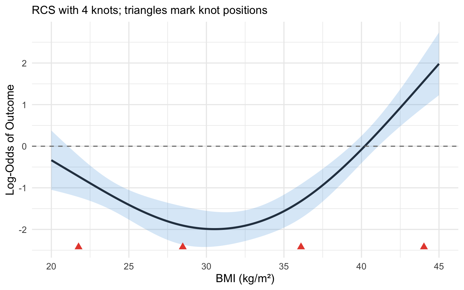
```{r}
#| label: fig-rcs-interpretation
#| fig-cap: "Illustration of an RCS(4) fit. Knot locations are marked with triangles. The relationship is linear beyond the outer knots and flexibly curved between them."
#| code-fold: true
#| warning: false
#| message: false
library(rms)
library(ggplot2)

set.seed(123)
n <- 500
x <- runif(n, 20, 45)
# True non-linear relationship (a gentle U-shape in BMI). The coefficients
# are kept modest so the outcome is not near-separated --- otherwise the
# fitted log-odds and their confidence band explode and the curve becomes
# invisible against a huge y-axis.
logit_p <- -2 + 0.02 * (x - 30)^2
p <- plogis(logit_p)
y <- rbinom(n, 1, p)

dd <- datadist(x)
options(datadist = "dd")

fit <- lrm(y ~ rcs(x, 4))
knot_locs <- attr(rcs(x, 4), "parms")

# Prediction across the range of BMI
x_pred <- seq(20, 45, length.out = 200)
pred <- as.data.frame(Predict(fit, x = x_pred))

# Zoom the y-axis to the fitted curve and its confidence band so the
# U-shape is clearly visible.
y_lo <- min(pred$lower)
y_hi <- max(pred$upper)

ggplot(pred, aes(x = x, y = yhat)) +
  geom_ribbon(aes(ymin = lower, ymax = upper), alpha = 0.2, fill = "#3498db") +
  geom_line(linewidth = 1.2, colour = "#2c3e50") +
  geom_point(data = data.frame(x = knot_locs, y = y_lo),
             aes(x = x, y = y), shape = 17, size = 3, colour = "#e74c3c") +
  geom_hline(yintercept = 0, linetype = "dashed", colour = "grey50") +
  coord_cartesian(ylim = c(y_lo, y_hi)) +
  labs(x = "BMI (kg/m\u00b2)", y = "Log-Odds of Outcome",
       subtitle = "RCS with 4 knots; triangles mark knot positions") +
  theme_minimal(base_size = 14)
```
## Clinical Example: CSF Glucose and Bacterial Meningitis
This example is adapted from Lopez-Ayala et al. [-@lopezayala2025], who use it to illustrate the full workflow for modelling a continuous predictor.
### The Clinical Question
In patients presenting with suspected meningitis, cerebrospinal fluid (CSF) glucose is one of several laboratory values used to distinguish bacterial from viral meningitis. Low CSF glucose is a hallmark of bacterial infection, as bacteria consume glucose. But what is the precise shape of this relationship? And is it appropriate to use a simple cut-point (e.g., CSF glucose < 2.2 mmol/L)?
### Step-by-Step Analysis
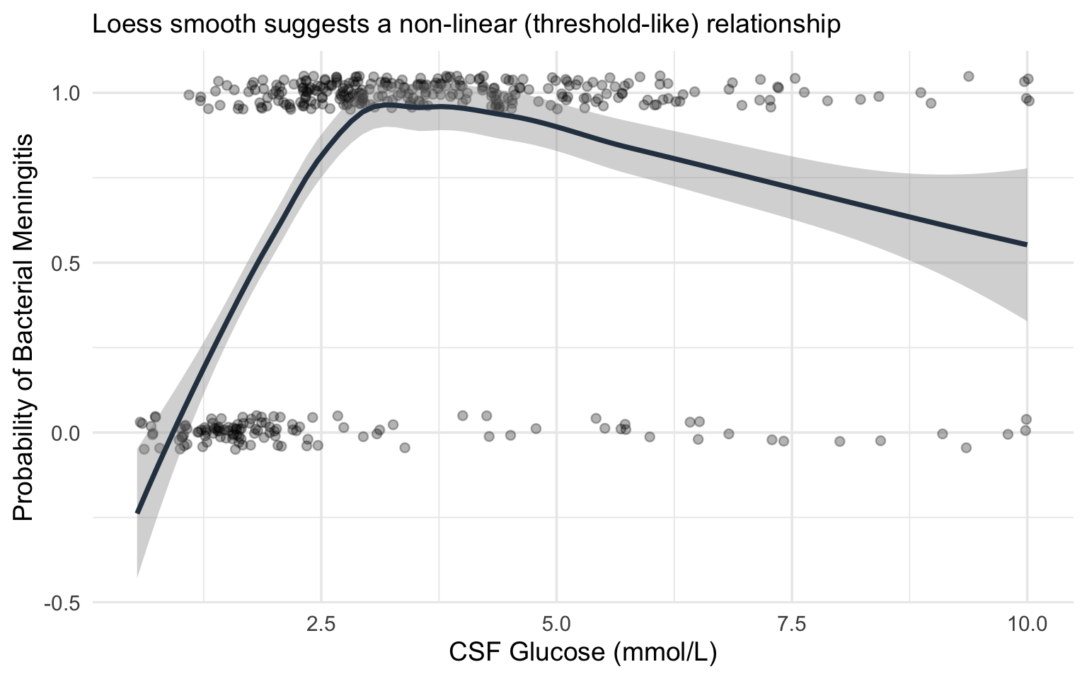
**Step 1: Visualise the raw relationship.**
Before fitting any model, plot the outcome against the predictor using a smoothing function (loess or GAM). This gives you a preliminary sense of the shape.
```{r}
#| label: fig-csf-glucose-raw
#| fig-cap: "Simulated relationship between CSF glucose and probability of bacterial meningitis, illustrating the non-linear (threshold-like) pattern."
#| code-fold: true
#| warning: false
#| message: false
library(ggplot2)
library(rms)

set.seed(2025)
n <- 400
csf_glucose <- rlnorm(n, meanlog = log(3), sdlog = 0.6)
csf_glucose <- pmin(csf_glucose, 10)

# True relationship: steep drop in probability below ~2, then flat
logit_p <- 3 - 4 * pmax(0, 2.5 - csf_glucose) - 0.3 * csf_glucose
p_bact <- plogis(logit_p)
bacterial <- rbinom(n, 1, p_bact)

df_csf <- data.frame(csf_glucose = csf_glucose, bacterial = bacterial)

ggplot(df_csf, aes(x = csf_glucose, y = bacterial)) +
  geom_jitter(height = 0.05, alpha = 0.3, width = 0.05) +
  geom_smooth(method = "loess", se = TRUE, colour = "#2c3e50") +
  labs(x = "CSF Glucose (mmol/L)", y = "Probability of Bacterial Meningitis",
       subtitle = "Loess smooth suggests a non-linear (threshold-like) relationship") +
  theme_minimal(base_size = 14)
```
**Step 2: Fit competing models.**
We fit three models and compare them:
- **Model 1 (Linear):** `bacterial ~ csf_glucose`
- **Model 2 (Categorised):** `bacterial ~ I(csf_glucose < 2.2)` (a common clinical cut-point)
- **Model 3 (RCS):** `bacterial ~ rcs(csf_glucose, 4)`
```{r}
#| label: model-comparison-csf
#| warning: false
#| message: false
library(rms)

dd_csf <- datadist(df_csf)
options(datadist = "dd_csf")

# Model 1: Linear
fit_linear <- lrm(bacterial ~ csf_glucose, data = df_csf)

# Model 2: Categorised
df_csf$glucose_low <- as.numeric(df_csf$csf_glucose < 2.2)
fit_cat <- lrm(bacterial ~ glucose_low, data = df_csf)

# Model 3: RCS with 4 knots
fit_rcs <- lrm(bacterial ~ rcs(csf_glucose, 4), data = df_csf)

# Compare AIC
aic_vals <- c(
  Linear = AIC(fit_linear),
  Categorised = AIC(fit_cat),
  RCS_4knots = AIC(fit_rcs)
)

cat("AIC Comparison:\n")
print(round(aic_vals, 1))
cat("\nLower AIC = better fit (penalised for complexity)\n")
```
**Step 3: Test for non-linearity.**
```{r}
#| label: nonlinearity-test
#| warning: false
#| message: false
# The anova() function in rms tests the overall effect and non-linearity separately
cat("ANOVA for RCS model:\n")
print(anova(fit_rcs))
```
The ANOVA output from `rms` provides two key tests:
- **Total effect** (all spline terms combined): tests whether CSF glucose has *any* association with the outcome
- **Nonlinear component** (spline terms beyond the linear): tests whether the relationship departs from linearity
If the non-linear component is significant, this confirms that a linear term is insufficient.
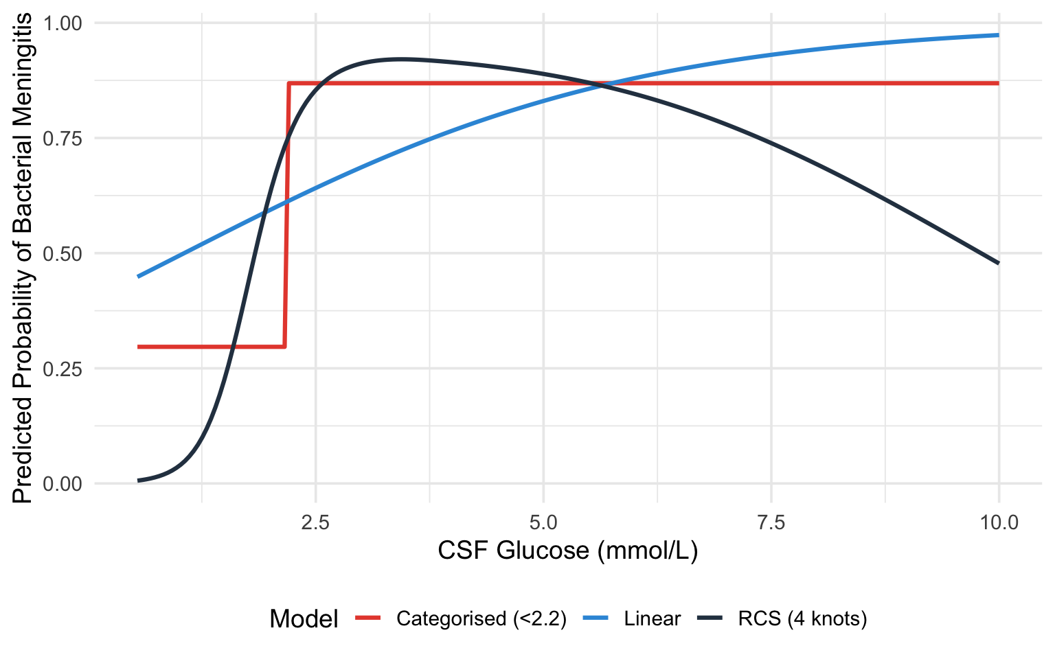
**Step 4: Plot the fitted curves from all three models.**
```{r}
#| label: fig-csf-model-comparison
#| fig-cap: "Comparison of linear (blue), categorised (red), and RCS (black) model fits for the CSF glucose--bacterial meningitis relationship."
#| code-fold: true
#| warning: false
#| message: false
x_seq <- seq(min(df_csf$csf_glucose), max(df_csf$csf_glucose), length.out = 200)

# Predictions from each model
pred_linear <- predict(fit_linear, newdata = data.frame(csf_glucose = x_seq),
                       type = "fitted")
pred_cat <- predict(fit_cat,
                    newdata = data.frame(glucose_low = as.numeric(x_seq < 2.2)),
                    type = "fitted")

pred_rcs_obj <- Predict(fit_rcs, csf_glucose = x_seq)

plot_df <- data.frame(
  csf_glucose = rep(x_seq, 3),
  probability = c(pred_linear, pred_cat, as.data.frame(pred_rcs_obj)$yhat),
  Model = rep(c("Linear", "Categorised (<2.2)", "RCS (4 knots)"), each = length(x_seq))
)

# Convert RCS from log-odds to probability for fair comparison
plot_df$probability[plot_df$Model == "RCS (4 knots)"] <-
  plogis(plot_df$probability[plot_df$Model == "RCS (4 knots)"])

ggplot(plot_df, aes(x = csf_glucose, y = probability, colour = Model)) +
  geom_line(linewidth = 1.1) +
  scale_colour_manual(values = c("Linear" = "#3498db",
                                  "Categorised (<2.2)" = "#e74c3c",
                                  "RCS (4 knots)" = "#2c3e50")) +
  labs(x = "CSF Glucose (mmol/L)", y = "Predicted Probability of Bacterial Meningitis") +
  theme_minimal(base_size = 14) +
  theme(legend.position = "bottom")
```
### What This Example Teaches Us
1. The **linear model** misses the threshold-like nature of the relationship. It estimates a constant decrease in probability per unit increase in glucose, which underestimates the risk at very low glucose levels and overestimates it at intermediate levels.
2. The **categorised model** captures the broad direction (low glucose = higher risk) but loses all nuance. It cannot tell you that a glucose of 0.5 mmol/L carries a very different risk than a glucose of 2.0 mmol/L --- both are simply "low."
3. The **RCS model** captures the steep decline in risk at low glucose levels and the flattening at higher levels, providing the most accurate and informative picture.
## Practical Recommendations
Lopez-Ayala et al. [-@lopezayala2025] provide a practical framework (their Box 2) that we adapt here:
::: {.callout-tip}
## Workflow for Modelling Continuous Predictors
1. **Keep continuous variables continuous.** Do not categorise unless there is a strong *a priori* biological or clinical reason (and even then, think twice).
2. **Start by visualising** the predictor--outcome relationship using a smoother (loess, GAM, or a spline with many knots).
3. **Fit a restricted cubic spline** with 3--5 knots as the default modelling strategy. Use 3 knots when sample size is small or the relationship is expected to be simple; 4--5 knots when sample size is adequate and the relationship may be complex.
4. **Test for non-linearity** using a likelihood ratio test or the Wald test from `anova(fit)` in `rms`. If non-linearity is not significant, you *may* simplify to a linear term --- but the spline model will give very similar results anyway, so simplification is optional.
5. **Present results as plots** showing the predicted outcome across the range of the predictor, with confidence intervals. Supplement with specific contrasts (e.g., odds ratio for value A vs value B) as needed.
6. **Do not report individual spline coefficients** in tables. They are not interpretable. Instead, report the overall test for the predictor and any non-linearity test, along with a figure.
7. **Use AIC or likelihood ratio tests** to compare models (linear vs spline, different numbers of knots).
:::
## Implementation
The `rms` package by Frank Harrell is the gold standard for this in R, and `patsy` + `statsmodels` give the equivalent capability in Python. The walkthroughs below are **fully self-contained and runnable**: each one first simulates a small example dataset (a continuous `predictor`, two `confounder`s, and a binary `outcome`) so you can run the code as-is, then fits and plots a restricted cubic spline. To use them on your own study, replace the simulated `dat` with your own data frame and keep the rest unchanged.
::: {.panel-tabset}
#### R
The key function is `rcs(variable, number_of_knots)` inside an `rms` model fit such as `lrm()`.
```{r}
#| label: r-implementation
#| warning: false
#| message: false
library(rms)
library(ggplot2)
# --- Simulated example data (replace this block with your own data) ---
set.seed(1)
n <- 400
predictor <- runif(n, 20, 45)
confounder1 <- rnorm(n)
confounder2 <- rbinom(n, 1, 0.4)
logit_p <- -8 + 0.05 * (predictor - 30)^2 + 0.3 * confounder1 + 0.5 * confounder2
dat <- data.frame(
outcome = rbinom(n, 1, plogis(logit_p)),
predictor = predictor,
confounder1 = confounder1,
confounder2 = confounder2
)
# Step 1: Tell rms about the data distribution (required for Predict/summary)
dd <- datadist(dat)
options(datadist = "dd")
# Step 2: Fit a logistic regression with the predictor modelled as an RCS(4)
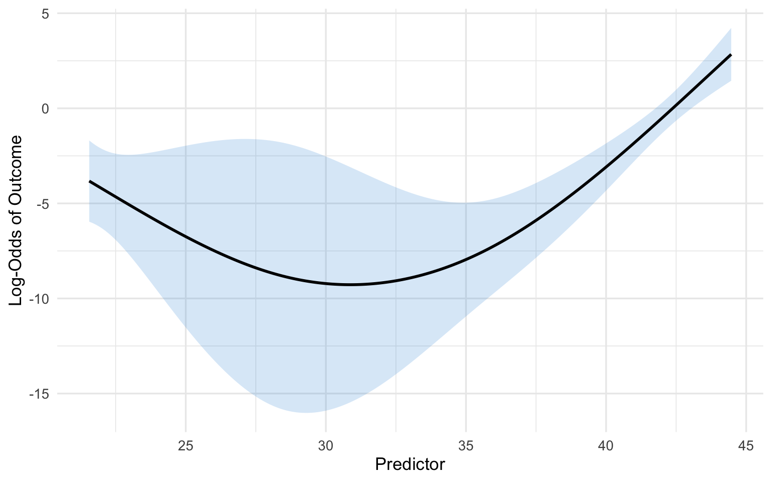
fit <- lrm(outcome ~ rcs(predictor, 4) + confounder1 + confounder2, data = dat)
# Step 3: Examine the model
print(fit) # Overall model summary
anova(fit) # Tests for each predictor (total effect + non-linearity)
# Step 4: Plot the fitted relationship across the range of the predictor
pred_df <- as.data.frame(Predict(fit, predictor))
ggplot(pred_df, aes(x = predictor, y = yhat)) +
  geom_ribbon(aes(ymin = lower, ymax = upper), alpha = 0.2, fill = "#3498db") +
  geom_line(linewidth = 1) +
  labs(x = "Predictor", y = "Log-Odds of Outcome") +
  theme_minimal(base_size = 13)
# Step 5: A specific contrast --- log-odds ratio for predictor 30 vs 25
summary(fit, predictor = c(25, 30))
```
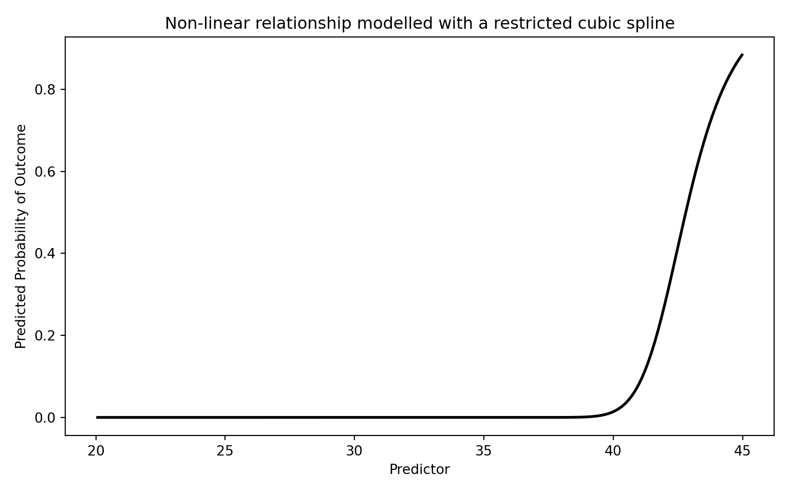
#### Python
`patsy`'s `cr()` builds a natural (restricted) cubic spline basis; `df` equals the number of knots minus one, so `df=3` corresponds to a 4-knot RCS.
```{python}
#| label: python-implementation
#| warning: false
#| message: false
import numpy as np
import pandas as pd
import matplotlib.pyplot as plt
import statsmodels.api as sm
import statsmodels.formula.api as smf
from scipy.special import expit

# --- Simulated example data (replace this block with your own data) ---
rng = np.random.default_rng(1)
n = 400
predictor = rng.uniform(20, 45, n)
confounder1 = rng.normal(size=n)
confounder2 = rng.binomial(1, 0.4, n)
logit_p = -8 + 0.05 * (predictor - 30) ** 2 + 0.3 * confounder1 + 0.5 * confounder2
dat = pd.DataFrame({
    "outcome": rng.binomial(1, expit(logit_p)),
    "predictor": predictor,
    "confounder1": confounder1,
    "confounder2": confounder2,
})

# Step 1: Fit using the formula interface. patsy's cr() builds a natural
# (restricted) cubic spline basis; df=3 corresponds to a 4-knot RCS. Using the
# formula API means statsmodels remembers the spline knots and reapplies them
# automatically when we predict on new data below.
model = smf.glm(
    "outcome ~ cr(predictor, df=3) + confounder1 + confounder2",
    data=dat, family=sm.families.Binomial(),
)
result = model.fit()
print(result.summary())
# Step 2: Plot the fitted relationship across the range of the predictor
# (holding the confounders fixed at reference values).
x_range = np.linspace(dat["predictor"].min(), dat["predictor"].max(), 200)
grid = pd.DataFrame({"predictor": x_range, "confounder1": 0.0, "confounder2": 0})
pred_prob = result.predict(grid)

plt.figure(figsize=(8, 5))
plt.plot(x_range, pred_prob, "k-", linewidth=2)
plt.xlabel("Predictor")
plt.ylabel("Predicted Probability of Outcome")
plt.title("Non-linear relationship modelled with a restricted cubic spline")
plt.tight_layout()
plt.show()
```
:::
## Comparison with Other Approaches
The table below summarises the main options. As a quick reminder of the two flexible approaches: **fractional polynomials** (introduced earlier in this chapter) model the predictor using a small number of non-integer powers (such as $\sqrt{x}$, $1/x$, or $\log x$) chosen to fit the data, giving a smooth global curve; **restricted cubic splines** instead stitch together local cubic pieces between knots and force straight lines in the tails. Both avoid the pitfalls of categorisation, but they bend the curve in different ways.
| Approach | Pros | Cons |
|:---|:---|:---|
| **Linear term** | Simple, 1 df | Assumes linearity --- often wrong |
| **Categorisation** | "Easy" to present | Information loss, bias, arbitrary cut-points |
| **Quadratic polynomial** | Can capture U-shapes, 2 df | Symmetric, poor boundary behaviour |
| **Fractional polynomials** | Flexible, parsimonious | Global functions; limited local flexibility |
| **Restricted cubic splines** | Flexible, good boundary behaviour, well-supported | Coefficients not directly interpretable |
| **GAM (smoothing splines)** | Very flexible, automatic smoothing | Can overfit; penalty selection needed |
: Comparison of approaches for modelling continuous variables {#tbl-comparison}
For most clinical research, **restricted cubic splines with 3--5 knots** represent the best balance of flexibility, parsimony, and practical usability.
## Exercises
### Exercise 1: Recognising the Problem
Consider a study of the association between systolic blood pressure (SBP) and stroke risk. The researchers categorise SBP into: normal (<120), elevated (120--129), Stage 1 hypertension (130--139), and Stage 2 hypertension (>=140).
**Questions:**
a) What assumptions does this categorisation impose on the SBP--stroke relationship?
b) A patient with SBP of 131 mmHg is classified identically to a patient with SBP of 139 mmHg. Why is this problematic?
c) Suggest a better modelling approach and explain how you would implement it.
### Exercise 2: Fitting and Interpreting Spline Models
Using the built-in `PBC` dataset (primary biliary cholangitis) from the `survival` package in R, model the relationship between serum bilirubin and transplant status (a binary outcome: transplanted or not).
::: {.panel-tabset}
#### R
```{r}
#| label: exercise-2-r
#| eval: false
library(rms)
library(ggplot2)

# Load the PBC data
data(pbc, package = "survival")
pbc <- pbc[!is.na(pbc$trt), ]  # Remove incomplete cases

# Create a binary outcome: transplanted (status == 1) vs not
pbc$transplant <- as.numeric(pbc$status == 1)

# Set up datadist
dd <- datadist(pbc)
options(datadist = "dd")

# Task 1: Fit a logistic regression with bilirubin as a linear term
fit_linear <- lrm(transplant ~ bili, data = pbc)

# Task 2: Fit a logistic regression with bilirubin modelled using RCS (4 knots)
fit_rcs <- lrm(transplant ~ rcs(bili, 4), data = pbc)

# Task 3: Test for non-linearity
anova(fit_rcs)

# Task 4: Compare AIC
AIC(fit_linear)
AIC(fit_rcs)

# Task 5: Plot the relationship
p <- Predict(fit_rcs, bili)
plot(p, xlab = "Serum Bilirubin (mg/dL)",
     ylab = "Log-Odds of Transplant")

# Task 6: What does the plot tell you about the bilirubin-transplant
#          relationship? Is it linear?
```
#### Python
```{python}
#| label: exercise-2-python
#| eval: false
import numpy as np
import pandas as pd
import matplotlib.pyplot as plt
import statsmodels.api as sm
from patsy import dmatrix

# Simulate data similar to PBC bilirubin-transplant relationship
np.random.seed(42)
n = 300
bili = np.random.exponential(scale=2, size=n)
bili = np.clip(bili, 0.3, 25)
logit_p = -3 + 0.1 * bili + 0.005 * bili**2  # Non-linear true relationship
prob = 1 / (1 + np.exp(-logit_p))
transplant = np.random.binomial(1, prob)

df = pd.DataFrame({'bili': bili, 'transplant': transplant})

# Task 1: Fit logistic regression with linear bilirubin
X_linear = sm.add_constant(df[['bili']])
fit_linear = sm.GLM(df['transplant'], X_linear,
                     family=sm.families.Binomial()).fit()
print("Linear model:")
print(fit_linear.summary())

# Task 2: Create spline basis and fit logistic regression with splines
spline_basis = dmatrix("cr(bili, df=3)", data=df, return_type='dataframe')
fit_spline = sm.GLM(df['transplant'], spline_basis,
                      family=sm.families.Binomial()).fit()
print("\nSpline model:")
print(fit_spline.summary())

# Task 3: Compare AIC
print(f"\nAIC Linear: {fit_linear.aic:.1f}")
print(f"AIC Spline: {fit_spline.aic:.1f}")

# Task 4: Plot the predicted log-odds across bilirubin range
bili_range = np.linspace(df['bili'].min(), df['bili'].max(), 200)
spline_pred = dmatrix("cr(bili_range, df=3)",
                       {"bili_range": bili_range},
                       return_type='dataframe')
pred_prob = fit_spline.predict(spline_pred)

plt.figure(figsize=(8, 5))
plt.plot(bili_range, pred_prob, 'k-', linewidth=2)
plt.xlabel('Serum Bilirubin (mg/dL)')
plt.ylabel('Predicted Probability of Transplant')
plt.title('Non-linear effect of bilirubin on transplant (RCS)')
plt.tight_layout()
plt.show()
```
:::
### Exercise 3: Categorisation vs Splines Head-to-Head
Simulate data with a known non-linear (U-shaped) relationship and compare the performance of categorised and spline models.
::: {.panel-tabset}
#### R
```{r}
#| label: exercise-3-r
#| eval: false
library(rms)
library(ggplot2)

set.seed(2025)
n <- 1000
x <- rnorm(n, mean = 50, sd = 10)

# True U-shaped relationship
logit_p <- -5 + 0.004 * (x - 50)^2
y <- rbinom(n, 1, plogis(logit_p))

sim_data <- data.frame(x = x, y = y)
dd <- datadist(sim_data)
options(datadist = "dd")

# Model 1: Categorise into quartiles
sim_data$x_cat <- cut(sim_data$x,
                       breaks = quantile(sim_data$x, c(0, 0.25, 0.5, 0.75, 1)),
                       include.lowest = TRUE)
fit_cat <- lrm(y ~ x_cat, data = sim_data)

# Model 2: Linear term
fit_lin <- lrm(y ~ x, data = sim_data)

# Model 3: RCS with 5 knots
fit_rcs <- lrm(y ~ rcs(x, 5), data = sim_data)

# Questions:
# a) Compare AIC of the three models. Which fits best?
# b) Plot all three fitted curves on the same graph along with the
#    true logit function. Which model best recovers the truth?
# c) What happens if you change the quartile cut-points to tertiles?
#    Does it affect the categorised model's conclusions?

cat("AIC values:\n")
cat("Categorised:", AIC(fit_cat), "\n")
cat("Linear:     ", AIC(fit_lin), "\n")
cat("RCS(5):     ", AIC(fit_rcs), "\n")
```
#### Python
```{python}
#| label: exercise-3-python
#| eval: false
import numpy as np
import pandas as pd
import matplotlib.pyplot as plt
import statsmodels.api as sm
from patsy import dmatrix
from scipy.special import expit

np.random.seed(2025)
n = 1000
x = np.random.normal(50, 10, size=n)

# True U-shaped relationship
logit_p = -5 + 0.004 * (x - 50)**2
y = np.random.binomial(1, expit(logit_p))

df = pd.DataFrame({'x': x, 'y': y})

# Model 1: Categorise into quartiles
df['x_cat'] = pd.qcut(df['x'], q=4, labels=['Q1', 'Q2', 'Q3', 'Q4'])
X_cat = pd.get_dummies(df['x_cat'], drop_first=True).astype(float)
X_cat = sm.add_constant(X_cat)
fit_cat = sm.GLM(df['y'], X_cat, family=sm.families.Binomial()).fit()

# Model 2: Linear
X_lin = sm.add_constant(df[['x']])
fit_lin = sm.GLM(df['y'], X_lin, family=sm.families.Binomial()).fit()

# Model 3: RCS
X_rcs = dmatrix("cr(x, df=4)", data=df, return_type='dataframe')
fit_rcs = sm.GLM(df['y'], X_rcs, family=sm.families.Binomial()).fit()

print(f"AIC Categorised: {fit_cat.aic:.1f}")
print(f"AIC Linear:      {fit_lin.aic:.1f}")
print(f"AIC RCS:         {fit_rcs.aic:.1f}")

# Plot all three fitted curves
x_range = np.linspace(df['x'].min(), df['x'].max(), 200)

# True curve
true_logit = -5 + 0.004 * (x_range - 50)**2
true_prob = expit(true_logit)

# RCS predictions
X_rcs_pred = dmatrix("cr(x_range, df=4)", {"x_range": x_range},
                      return_type='dataframe')
rcs_prob = fit_rcs.predict(X_rcs_pred)

# Linear predictions
X_lin_pred = sm.add_constant(pd.DataFrame({'x': x_range}))
lin_prob = fit_lin.predict(X_lin_pred)

plt.figure(figsize=(10, 6))
plt.plot(x_range, true_prob, 'k--', linewidth=2, label='True relationship')
plt.plot(x_range, rcs_prob, 'b-', linewidth=2, label='RCS')
plt.plot(x_range, lin_prob, 'r-', linewidth=1.5, label='Linear')
plt.xlabel('Predictor (x)')
plt.ylabel('Predicted Probability')
plt.legend()
plt.title('Comparing modelling strategies for a U-shaped relationship')
plt.tight_layout()
plt.show()
```
:::
## Summary
| Key Concept | Details |
|:---|:---|
| **Do not categorise** | Categorising continuous variables loses information, introduces bias, and reduces power |
| **Linear terms** | Assume a constant effect per unit change; often wrong for biological variables |
| **Fractional polynomials** | Use non-integer powers for flexible global curves; parsimonious but limited locally |
| **Splines** | Piecewise polynomials joined at knots; flexible and locally adaptive |
| **Restricted cubic splines** | Splines forced to be linear in the tails; recommended default with 3--5 knots |
| **Interpretation** | Use plots and contrasts, not individual coefficients |
| **Testing** | Overall association test ($k-1$ df); non-linearity test ($k-2$ df) |
## References {.unnumbered}
::: {#refs}
:::
<!-- Reference list (for use with a .bib file) -->
<!--
@article{lopezayala2025,
author = {Lopez-Ayala, Pedro and others},
title = {Modelling continuous variables in clinical research: an overview},
journal = {BMJ},
year = {2025},
doi = {10.1136/bmj-2024-082440}
}
@book{harrell2015,
author = {Harrell, Frank E},
title = {Regression Modeling Strategies},
edition = {2nd},
publisher = {Springer},
year = {2015}
}
@article{royston2006,
author = {Royston, Patrick and Altman, Douglas G and Sauerbrei, Willi},
title = {Dichotomizing continuous predictors in multiple regression: a bad idea},
journal = {Statistics in Medicine},
volume = {25},
pages = {127--141},
year = {2006}
}
@article{royston1994,
author = {Royston, Patrick and Altman, Douglas G},
title = {Regression using fractional polynomials of continuous covariates: parsimonious parametric modelling},
journal = {Journal of the Royal Statistical Society: Series C},
volume = {43},
pages = {429--467},
year = {1994}
}
-->